1. Overview
PostProc 2 is a software for the analysis and post-processing of time-dependent data, as they are generated in dynamic simulation programs (e.g. DELPHIN, THERAKLES, NANDRAD, MASTERSIM, and any other simulation programs). It is also well suited for the analysis of measured and experimental data. PostProc 2 therefore necessarily requires a time reference in the data set (see data formats/data types), and for most diagrams the X-axis is the time axis.
For data with additional coordinate reference (e.g. field outputs), it is of course also possible to display only the data of a time point. In this case the X-axis is always a coordinate axis, and if necessary the Y-axis as well, for example in colour gradient diagrams.
1.1. Overview of functionality
The post-processing provides/supports:
-
Import of data in different input data formats
-
Data display, zoom in, unit conversion, linear/log scales for the axes, …
-
flexible and fast diagram formatting and export to vector or bitmap graphics (with precise size and scaling settings for correct print display)
-
Analysis and transformation of data with models
-
Calculations with data sets
-
Updating the view/diagrams when the source data changes without losing formatting (live view of the results while the simulation is still running)
1.1.1. Specialities and nice functions
An essential feature of PostProc 2 is the separation of data and their visualisation. It allows the updating of data/files and thus also a live view of the calculation results (see section Data update).
In a session (something like a project file) different diagram configurations are stored. The session file with extension p2 is itself an XML file and can therefore be easily edited in a text editor. You can also easily duplicate diagram configurations in the text editor, or make changes in several places by search-and-replace. One could also create and adapt session files automatically via a script.
|
You can open the current session file in a text editor with the keyboard shortcut |
The actual data is not stored in the session file, but referenced in external files. This allows the latter to be easily updated and PostProc 2 will simply display the new data when reading/updating the session file. Very practical!
|
Session files, as XML files in ASCII format, work well in version control systems. |
The diagram export can also be executed automatically via a command line command. This makes it possible to create a p2 session file completely automatically and then generate a pdf/svg/png diagram via command line. This is very practical if you want to automatically create a large number of similar diagrams, each with different data (see Command line reference).
1.1.2. Diagram types
Different types of diagrams can be created. Basically, one can distinguish between 2D and 3D diagrams, whereby in 3D diagrams the third dimension is represented as a colour or isoline. Vector field outputs (e.g. of flow fields) are also possible.
Time-value diagrams
In time-value diagrams, the X-axis is the time axis and several curves are displayed above it, although two different Y-axes can also be used.
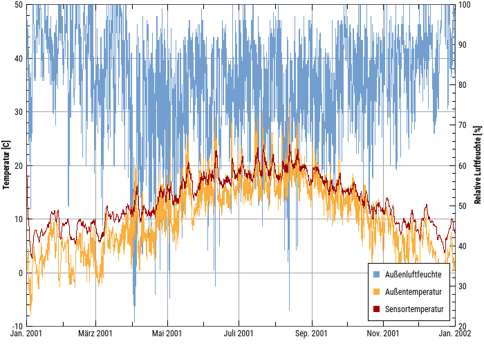
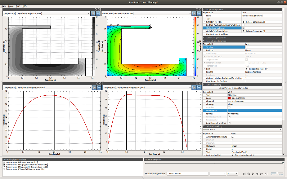
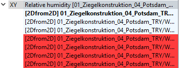
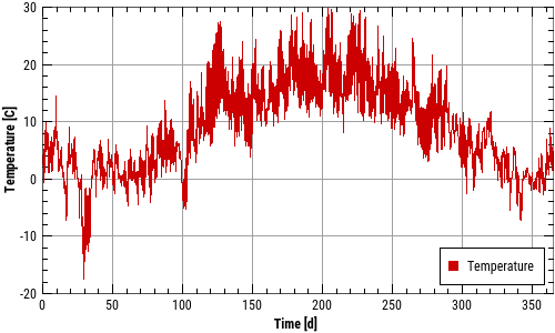
This is a typical time-value diagram, with the time axis formatted as a date axis, and two Y-axes for temperature and humidity respectively. Any number of lines can be displayed here, as long as their physical units correspond to one of the two Y-axes.
Profile plots (coordinate-value diagrams)
3D data (i.e. time-coordinate-value) can also be displayed in classic 2D diagrams, where the X-axis is the coordinate and the values are displayed at a certain point in time.
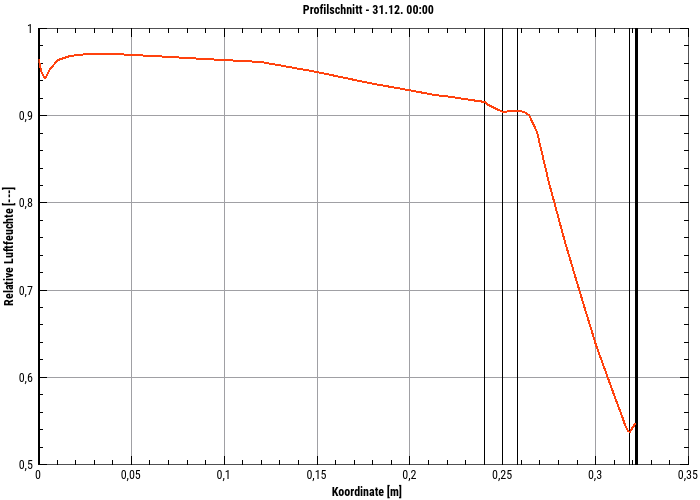
This is a 2D diagram showing a time-animated profile of one (or more) physical quantities over the geometry for a selected point in time. In this representation construction lines/material layers can be drawn by thin lines. The point in time can be easily changed in the surface and can thus show an animation.
Colour gradient/spectral diagrams
3D data as above can also be displayed as colour gradient diagrams:
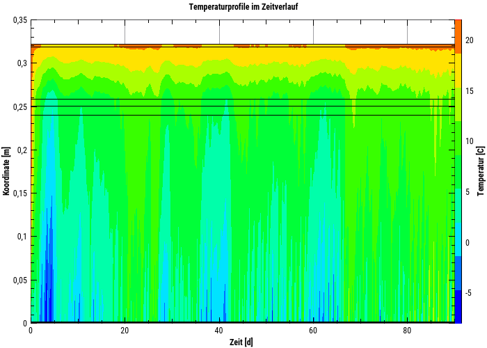
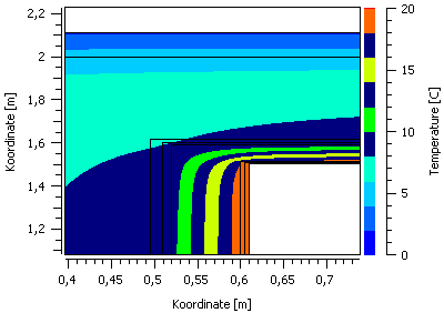
A colour gradient diagram (3D), which shows the temporal course of temperature profiles. The X-axis is a time axis, the Y-axis is the coordinate and the colour represents the numerical values (e.g. a temperature).
Representation of 2D geometries as time-animated colour gradient diagrams
4D data (i.e. time-coordinate-coordance-value) can be displayed in time-animated colour gradient diagrams.
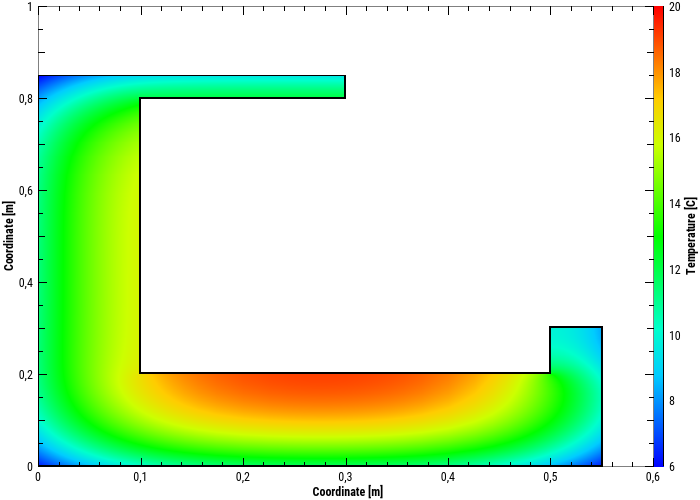
In such a colour gradient diagram, which here shows a temperature field for a selected simulation time, the axes here represent the coordinates, and the colour the respective value.
1.1.3. Display configurations
In PostProc 2, several diagrams can be displayed simultaneously. In the case of time-animated diagrams, it is possible to change the time in several or all diagrams equally. In this way, related physical effects can be easily analysed.
2. Program interface
The user interface is divided into the main window with one or more diagrams and the panels on the sides and at the bottom.
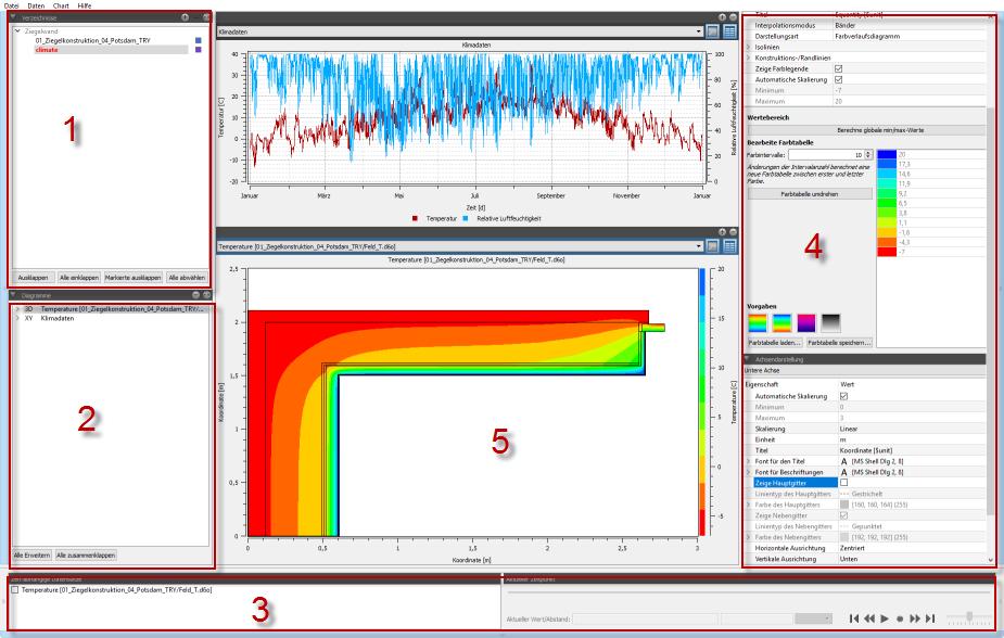
2.1. Elements of the program interface
-
Directory tree to manage the directories with data records/files (see Data management)
-
Overview of created diagrams and curves/series contained therein (see diagram management)
-
List of all time animated diagrams and control of the currently displayed time (see diagram animation)
-
Diagram properties (see diagram formatting)
-
Diagram or diagrams (see diagram window)
The panels on the left (1 and 2), right (4) and bottom (3) can be folded away by clicking on the buttons at the edge:
|
With the shortcut command |
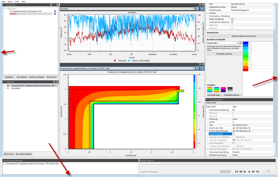
2.2. Switch between data manager view and chart view
By clicking on the directory tree (1), the data manager view appears, i.e. a table with evaluable data records (see data management):
By clicking on the Diagram tree structure/diagram management the post-processing switches to diagram editing mode (shows the available diagrams).
2.3. Sessions
The term session refers to all the data currently displayed in PostProc 2. This includes:
-
added and selected data directories (and their unfolding state),
-
created diagrams, their type and configuration,
-
source data referenced by the diagrams and information for extracting the data, and
-
program interface settings.
A session can thus be compared to a project management file. Sessions are saved in session files with the extension p2 (XML format).
2.4. Session file format
The session files are written in XML format. Normally only the changed data is written to the file. However, if you want to adjust your own parameters, you can first have all parameters written out. To do this, you have to activate the option Write complete session file in the settings dialog (File - Settings).
Section Session file format gives a short overview of the file structure with links to the respective manual sections with the format details.
2.5. Edit session files in external text editor
It is possible to adapt these session files externally in the editor and then reload them. In this way, script-based evaluation sessions can be generated. Formatting settings of one diagram can also be easily transferred to another diagram.
The external text editor can be opened via the menu command File - Edit session file in text editor or via the keyboard shortcut F2. If the session file has been saved externally, the PostProc 2 will ask at the next activation whether the modified file should be loaded.
The text editor to be used can be selected in the settings dialogue.
|
|
2.6. Open selected session file at program start
By default, PostProc 2 attempts to reload the last session file when the program starts. This behaviour can be changed in the settings dialog so that an empty session is started instead.
If you want to start the post-processing with a selected session directly, you can specify it on the command line, e.g:
> PostProcApp.exe C:\Path\to the\session.p2See also command line reference.
2.7. User settings/data directory
Configuration data and user data in general are stored in the user-specific data directory.
For example, if the user name is simulant, this user directory can be found in the following locations depending on the operating system:
| Platform | Path |
|---|---|
Windows |
Example: |
Linux |
Example: |
MacOS |
Example: |
2.8. Error analysis/log file
The post-processing works with user data, which can be faulty or unsuitable in many ways. If errors occur during the management and analysis of the data, these are not reported to the user via error message windows, but are written into a log file or into the log window. The content of the log file is also helpful for error reports.
The log file is displayed by means of the menu command: Data - Show log file...
The log file is located in the user specific data directory.
2.9. Log window in the programme
The log window is located in the lower panel and is normally not visible. It can be shown and hidden again by clicking on the lower left panel button:
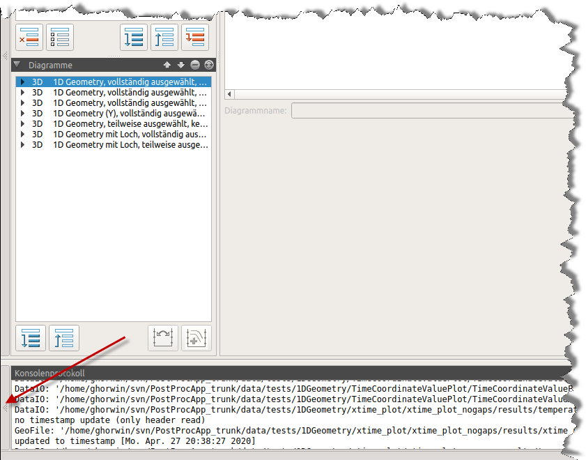
There are messages of varying degrees of urgency; some are only informative, some are progress messages. You can set the desired level of detail of the messages for both the log file and the log window output independently. For this purpose, there is a tab General Settings in the settings dialog File - Settings. The path to the log file is also listed in this dialog.
3. Data import and data management
The first step in creating charts and data analysis is the selection of data sets and files.
3.1. The directory tree
3.1.1. Adding directories with files to be evaluated
First, a (basic) directory for data evaluation is added to the directory tree (see Fig. Directory tree), which is then searched for supported data files.
Directories are added using the ![]() button and are then searched for supported result files. With
button and are then searched for supported result files. With ![]() they are removed again.
they are removed again.
When adding a directory, the directory itself and all subdirectories are searched for evaluable files in known file formats.
|
If you add a directory containing no evaluable files, the directory tree remains unchanged. In principle, directories without evaluable files are not displayed in the directory tree. |
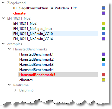
The directory tree now contains all directories (and their subdirectories) which contain result data. Directories written in grey do not contain result data themselves, but at least one of the subdirectories does (see figure Colour assignments to directories). All directories with data are assigned a colour, which makes it easy to recognise the assignment of the individual files later.
|
Any number of directories can be added. However, it is not possible to add a directory within an already added directory hierarchy. Similar to adding empty directories, nothing happens. |
In the directory tree, only the directories relative to the selected directory are added. However, the absolute path can be displayed as a tooltip:
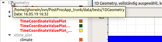
Simulation results from the IBK simulation programmes are stored in a project-specific directory structure. PostProc 2_ recognises this and summarises the data clearly:
|
Directory hierarchies from NANDRAD, DELPHIN, THERAKLES, MASTERSIM etc.
A special feature are simulation output directories from the IBK simulation programmes DELPHIN, THERAKLES, NANDRAD and MASTERSIM. The project directory contains further subdirectories with the actual data. Starting from a project file RealKlima.d6p, DELPHIN would create the following directory structure for example: projects/
├── RealKlima.d6p
└── RealKlima
├── log
│ ├── integrator_cvode_stats.tsv
│ └── ...
├── results
│ ├── Flux_Humidity_NORD.d6o
│ ├── ...
│ └── TemperatureSensor.d6o
└── var
├── ...
└── restart.bin
If the parent directory projects was selected, only RealKlima would appear in the directory tree below the projects node and no further subdirectories. All evaluable files from the subdirectories log, results and var would then be assigned to the directory RealKlima. This makes the directory tree clearer. 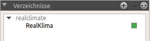
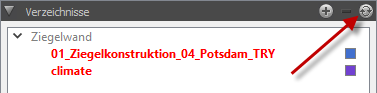
Figure 12. Directory tree after adding the parent directory of a simulation directory
If you select the directory RealClimate when adding, the node RealClimate will be displayed in the directory tree, and below it the subdirectories log, results, and var will be displayed as child elements, depending on which directory contains evaluable files. 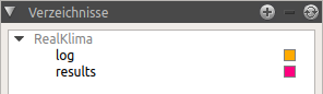
Figure 13. Directory tree after adding the simulation directory itself
It is therefore recommended to add the parent directory of the simulation project files for analysis. |
3.1.2. Mark directories for data analysis
In the next step, the directories selected for analysis are marked (double click on the directory). This causes the files/data records that can be evaluated in the directories to appear in the data record table. At the same time the marked directories are written in red in the directory tree (see screenshot in fig. directory tree). A further double click on the red marked directories removes the content of these folders again.
The buttons at the bottom of the directory tree are also used to select/deselect directories.
|
Select currently marked directory for analysis (mark it like double-click on a directory) |
|
deselect the selected directory (as with double-click on a selected directory) |
|
Unfold all directory nodes |
|
Fold all directory nodes |
|
Unfold the directory nodes so that all marked directories are visible |
3.1.3. The data manager view
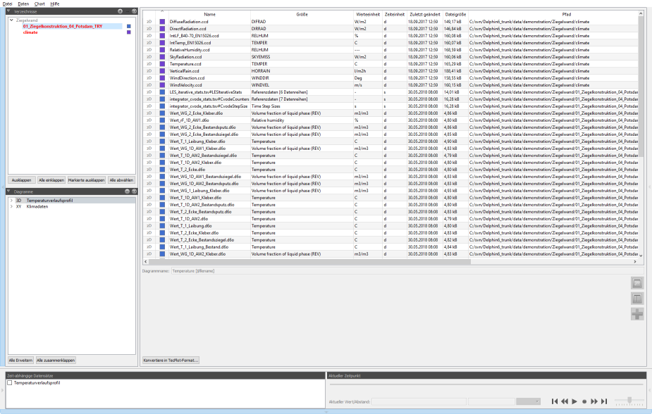
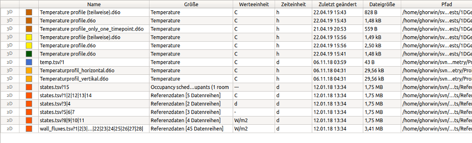
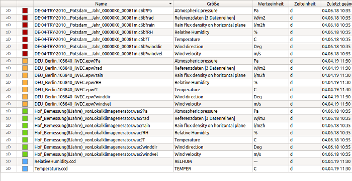
In the data manager the different data sets with essential parameters are displayed in a table. The first column indicates the data type (see data formats/data types). The colour column shows from which directory the file originates (or from which project).
|
The colour associated with a directory can be changed by double-clicking on the colour square next to the directory node in the directory tree. In this way, the individual output files can be easily distinguished even if they have the same file name (e.g. in a variant study). |
The column size indicates the physical size given in the file (not file size!). Depending on the file type, this can be a keyword, a character string or a generic text, e.g. reference data [2 data series]. Then follow two columns with the physical units (unit of value and unit of time), which are used in the data set. Then follow file attributes.
For reference data or generic table data (e.g. [csv] or [tsv], see data formats/data types) different columns can have different physical units, e.g. C for degrees Celsius for a temperature and Pa for Pascal for print variables. Since only one value unit is allowed per data record / line, one data record is created from the original file for each physical unit. The specified file name then has the format ‘<file name>?<suffix>’. In further use, however, such data records are treated exactly like others.
3.1.4. Updating the directory structure
External programs can be used to add new result data to the directory structure managed by post-processing or directories can be removed. Post-processing does not automatically monitor the directories, but if necessary, the directory structure can be re-read by using the update button ![]() to update both the directory tree and the data manager view.
to update both the directory tree and the data manager view.
3.2. Data formats/data types
PostProc 2_ can import data from various file formats, which are then interpreted as data records with different formats depending on their content. For this purpose, it is helpful to know the data types and file formats that PostProc 2 supports and how to prepare your own data for analysis.
|
This chapter is somewhat lengthy, as the individual file and data formats are explained in detail. You can also jump straight to the chapter diagram creation and if necessary read on here as in a reference. Interesting is the chapter Import of own 2D datasets, in which some methods are described how to get own data from any source into the post-processing the fastest way. |
3.2.1. Data formats
2D data sets
These are time-value pairs from which 2D diagrams (time, value) can be created. Examples are sensor values, i.e. outputs of physical quantities at certain coordinates or measurement data, integral flow quantities or generally scalar, time-dependent outputs.
3D data sets
These are data sets with 3 independent variables, specifically: time-coordinate-value, where the coordinate stands for one coordinate axis each. Examples would be time X-value data or time Y-value data.
3D data sets can be created as result data of simulation programs with partial differential equations, and correspond to profile sections in X, Y or Z direction.
In contrast to 2D data sets there are at least 2 different coordinates with assigned values for each point in time.
|
Using a cutting operation in a 2D construction, e.g. when defining an output in DELPHIN, does not necessarily lead to a 3D data set. For example, in a 1D simulation with grid in X-direction, you could define a Y-cut. As only one Y-coordinate per point in time is used in the output, you only get one 2D data set. |
In PostProc 2 it is possible to cut a 2D data set from a 3D data set by fixing a point in time or a coordinate. By fixing a point in time (time cut) you get a 2D diagram with coordinate on the X-axis and the value on the Y-axis.
|
Depending on the data set available, the coordinates of a time slice can be either X, Y or Z coordinates. In PostProc 2 the coordinate always is nevertheless displayed on the X-axis, even if in the case of Y-coordinates (e.g. from a horizontal roof construction) it leads to a rotated construction view. |
By defining a coordinate (value cut) a classic 2D sensor diagram is obtained, with time on the X-axis and value on the Y-axis. It is also possible to display such a value cut together with other 2D data sets in one diagram.
The complete 3D data set can be displayed in a colour gradient diagram, where the X-axis is the time and the Y-axis is the coordinate, and the value is displayed as a colour.
4D data sets
These are data sets with 4 independent variables, specifically: time-coordinate-coordinate-value. Also here the assignment of an axis to the coordinate is arbitrary, so XY, YZ, XZ are possible.
A representation of 4D data sets in a diagram is not possible, therefore at least one of the variables must be recorded. By fixing the point in time, the first or second coordinate, a 3D data set can be extracted. The most common way is to fix the point in time, which results in time-animated colour gradient diagrams.
When fixing two variables, a 2D data set is extracted.
5D data sets
Such time-X-Y-Z value data are generated during field outputs in simulations of 3D geometries. Similar to 4D data, 3D or 2D data sets must first be extracted by fixing variables in order to be able to display them.
3.2.2. File types and file extensions
PostProc 2_ supports a wide range of file formats for the specification of 2D data records. For the specification of 3D, 4D and 5D data sets the DataIO format is used exclusively.
Files with the following file extensions are read by PostProc 2 and checked for evaluable data
| File extension(s) | Description |
|---|---|
|
ASCII or binary output files of DELPHIN 5/6 (see DataIO file format) |
|
tab-delimited columns with header |
|
Comma-separated columns with header |
|
monitoring tools variant of the csv format (several headers, … ) |
|
climate data container (see climate files and climate data container) |
|
climate data from DELPHIN 5/6 (see also climate files and climate data containers) |
|
CVODE Solver statistics files from DELPHIN 5 |
There are also special data format readers for the generic time integration solver outputs (from DELPHIN, NANDRAD, THERAKLES and MASTERSIM):
-
integrator_cvode_stats.tsv -
integrator_ImplicitEuler_stats.tsv -
progress.tsv -
LES_direct_stats.tsv -
LES_iterative_stats.tsv
The requirements for csv and tsv files (easy to copy from Excel, LibreOffice etc.) are described in the following section import of own 2D datasets.
The special csv monitoring file format (is recognised by the special header and is evaluated fundamentally different from "normal" csv files) is described in the following publication:
Vogelsang, S. ; Sonny, A.: Monitoring Tools File Specification, 2016, link:http://nbn-resolving.de/urn:nbn:de:bsz:14-qucosa-199034 [http://nbn-resolving.de/urn:nbn:de:bsz:14-qucosa-199034]
3.2.3. Import of own 2D data records/generic csv/tsv files
The use of own time series in post-processing is very easy. For example, you can simply copy a table from a spreadsheet (Excel etc.) into a file. The individual columns are automatically separated by tabulator characters. Such a file should then have the file extension tsv. Table data can also be saved as a csv file and then read into PostProc 2. In the following the small differences in the handling of csv and tsv files are described.
In order for the post-processing to display and assign the data, these table files must have a header line with a column heading.
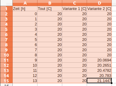
tsv file with 3 data series and one time columnTime [h] Tout [C] Version 1 [C] Version 2 [C] 0 20 20 20 1 20 20 20 2 20 20 20 3 20 20 20 4 20 20 20 5 20 20 20 6 20 20 20 7 20 20 20 8 20 20 20 9 20 20 20.0694 10 20 20 20.2651 11 20 20 20.4782 12 20 20 20.783 13 20 20 21.1447 ...
With the tsv format, it is irrelevant whether the numbers are directly below each other as long as they are separated by tabulator characters.
You get such a file automatically if you copy a table from a spreadsheet, as shown in the following screenshot.
|
It is important to give the files the extension tsv or csv. When searching the directories for displayable files, PostProc 2 sometimes has to analyse a lot of files. In order to avoid this taking too long, text files in table format are only looked for tsv and csv files. This means that even if a txt file contains a valid table, PostProc 2 will not display/use it. |
Supported format variants
All variants of csv and tsv files use numbers in English format without thousands separators, for example 12.2, 12e5 or -1.23e-12.
The following formats are supported:
Time [h] Tout [C] Version 1 [C] Version 2 [C]
0 20 20 20
10 20 20 20.2651
13 20 20 21.1447
Date/Time Tout [C] Variant 1 [C] Variant 2 [C]
2001-01-01 00:00 20 20 20
2001-06-24 05:00 20 20 20.0694
2001-06-27 05:00 20 20 20.783
|
Actually, files with tab characters as column separators should always have the file extension tsv. But there are some simulation programs that write tab-delimited ASCII data as csv files. To avoid having to rename the files each time, simply check for tab-delimited columns by checking both |
time [h],Tout [C],variant 1 [C],variant 2 [C]
0,20,20,20
9,20,20,20.0694
12,20,20,20.783
|
Specifying a time unit in the time column such as [h]` in the above example has no effect on comma-separated files. Comma-separated files always have always seconds as the time unit. |
"time","outputs[1]","outputs[2]"
0,25,20
0.001,25,20.01
0.002,25,20.02
0.003,25,20.03
0.004,25,20.04
|
For files with comma-separated columns, assume that any [] is part of the variable name as in the previous example. To avoid an error message during the unit check, a unit search is not performed in the header line of comma-separated files. Therefore, when using units in the header line (see following chapter), it is essential to use the tab-delimited tsv variant. The use of date/time stamps in the time column not is also supported for csv files. |
Format and content of the header for tsv files
A text data file must contain a header (and only one). From the 2nd line on, the data follows without any further blank line.
The first column is always the time column, where you can either specify relative time intervals or timestamps (see time column).
All other columns are data columns.
|
The number of columns is determined from the header line (number of strings separated by tabs). All data rows must necessarily have the same number of columns (i.e. the same number of tabulator characters). |
To enable PostProc 2 to distribute output sizes sensibly on axes or to convert units into each other, a unit should be specified for each column (=physical size). For this purpose you can specify a unit within square brackets in the column header. An example for such a header is:
Time [d] <tab> outdoor temperature [C] <tab> indoor temperature [C] <tab> indoor humidity [%]
(‘<tab>’ corresponds to the tab character).
In the data manager table this file would be displayed in two lines, one with the unit C and one with the unit %.
|
If a column header does not contain square brackets, the variable is managed as a unitless -. |
Time formats in tsv files
In tsv files, the time of a data point can basically be specified in 2 different ways:
-
time points are given relatively by specifying a time interval in a given unit. This unit (s, min, h, d, a, …) must be specified in the header of the first column, for example "time [h]". If you want to display such a relative defined dataset in a date/time axis, you have to define a zero point in time (see Axis display).
-
time points are specified as absolute time points by means of time stamps. In this case, the heading of the first column may not contain no time unit, and the points of time must therefore be specified as character strings in the format yyyy-MM-dd hh:mm or yyyy-MM-dd hh:mm:ss. An example of such a time column is shown above.
3.2.4. Climate files and climate data containers
The data contained in a climate file are presented as individual data records.
|
Climate data are always interpreted as instantaneous values. For example, in an EPW file the first time is 2000,01,01,1,60 and means 01.01.2000, 1st hour, 60th minute of the 1st hour, i.e. end of the first hour. This means that the climate data given in this line are displayed at the time 01.01.2000 1:00. If a different interpretation is desired, e.g. assumption of mean values etc., the data must be edited beforehand (e.g. in a spreadsheet) and shifted in time. |
3.2.5. The DataIO format
The file format of the out, d6o and d6b files including the referenced geometry files (g6o and g6b files) is described in the following publication:
Vogelsang, S.; Nicolai, A.: Dolphin 6 Output File Specification, http://nbn-resolving.de/urn:nbn:de:bsz:14-qucosa-70337
Compared to the tsv format described above, 2D DataIO containers contain additional header data, but are otherwise comparable in content (tsv files are usually easier to create).
3D, 4D and 5D data sets can only be stored in DataIO containers. The PostProc 2 example data and diagrams can be used here as a template and additional explanation to the technical report cited above.
3.2.6. Grouping of data records by unit of value
Regardless of the data source, PostProc 2 tries to display columns (i.e. data series) grouped with the same physical unit. The order of the data series in the file does not matter.
In figure display of climate data you can see very clearly how several data sets are extracted from a single file. The radiation data (all with unit W/m2) are grouped per data file and displayed in one data record. The text Reference data [3 data sets] in the column Size indicates that this data set contains several data series.
|
The grouping of similar physical quantities in one row of the dataset table is very practical for analyses of large buildings with many zones. In this case, all zone temperatures are summarised in one data record each and an overview is maintained in the data record table. |
The selection of one or more data series from a grouped data set is made when creating a diagram (see Creating Diagrams).
3.2.7. Column identification for grouped data records
Grouping records by unit can cause different columns of an tsv file to appear in different rows (records). Then the name of the original file appears several times and differs in the attached column numbers.
For example, a file sensor data.tsv with content:
Time [h] T1 [C] T2 [C] RH 1 [%].
0 20 12 55
1 22 13 56
is displayed in the file list as follows:
Sensor data.tsv?1|2
Sensor data.tsv?3
The question mark that only individual columns from the file are combined in this data record row. Then follow column numbers separated by |, where the first column (after the time column) has the index 1. So in the example above the two temperature columns are grouped in the first data record and the second data record contains the humidity column RH 1.
3.2.8. Error analysis
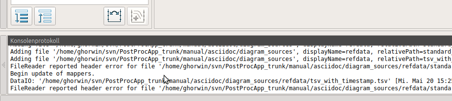
It occasionally happens that own evaluation files in PostProc 2 are regarded as faulty and are not displayed. Mostly you can get a tooltip with a short error message by holding the mouse over the file name:
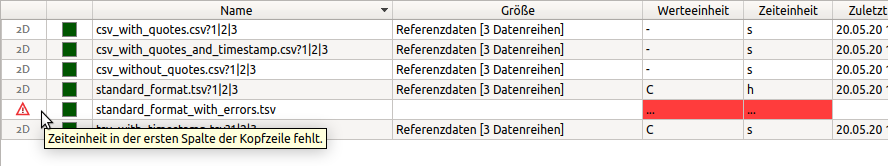
Additionally you can look into the log window:
4. Creation of diagrams
Once data sets are visible in the data management window, they can be used to create charts or tables.
In principle, diagrams can be created from single or several data sets. The latter is useful if several lines are to be displayed simultaneously in a 2D diagram. You can select several data sets/data series immediately when creating the diagram, or later add data series to an existing diagram add.
4.1. Creating a chart
To create a diagram, first select a data set from the data set list. A range of adjacent datasets can be selected using Shift+Click or Shift+Hold and Cursor Key Move. Individual data sets can be added by using Ctrl+Click.
|
It is only possible to create a diagram if the selected data sets are compatible in type. Also, 3D colour gradient diagrams can only display one data set at a time, so multiple selection is not allowed here. |
If individual data sets or matching data are selected, the 2D or 3D configurator for data extraction is displayed under the data set table. Depending on the source data, certain settings can be made here. These determine the way in which, for example, a 2D data set is to be extracted from a 4D data file. Details on these settings are explained on the pages for 2D diagrams and 3D diagrams.
Finally, an identifier can be specified for the diagram, whereby the name can contain placeholder. For 2D diagrams you can also specify a default name for the individual lines, whereby the use of Placeholder/ text replacement is of course useful.

Once all entries have been made, a diagram can be created by clicking on the diagram symbol ![]() at the bottom right. Afterwards PostProc 2 switches to the diagram view.
at the bottom right. Afterwards PostProc 2 switches to the diagram view.
|
Background information about diagrams and extractors
A diagram and the corresponding table view ultimately describe how the raw data is to be interpreted and presented. This information is ultimately instructions on how to extract and display the data from a data set file. This includes unit conversions, and information on how to cut data from data fields or whether model calculations are made. These instructions can be reapplied at any time if the raw data changes, which makes it very convenient to update the data without having to specify all settings again. The first step in this type of data handling is to cut (or extract) the data from the raw data. To do this, extractors are configured when the diagram is created (or when a data set is added to an existing diagram). These extractors are part of the data series property. For example, it is specified that a 2D data set (time-value curve) is cut out of a 3D data set by cutting at a certain x-coordinate. In addition to the extraction information, it is specified separately how_ the extracted data is to be displayed. In the case of line diagrams, for example, these are the numerous line properties, and also the assignment to the left or right diagram axis. The information about the creation and configuration of diagrams is stored in the session file, and is then applied to changed input data (data sets). |
4.2. 2D diagrams
In post-processing, 2D diagrams are always line diagrams (even if their appearance can be changed). This means that several series with the same X-axis but possibly different Y-axes are displayed in one diagram. A maximum of 2 Y-axes are possible. If only one is used, this is only the left Y-axis.
|
The terms line, series, curve, data series are all used synonymously in this context. |
Each series is assigned a Y-axis, whereby all curves of a Y-axis must also have the same physical unit. Thus, a maximum of two different value units can be used in a diagram.
The X-axis can either be a time axis, e.g. if scalar quantities such as sensor data are displayed over time. Or it can be a coordinate axis, if profiles over a 1D-geometry are displayed animated in time. In this case all displayed series correspond to a selected point in time.
When creating a 2D-diagram you have to select the desired series from the data sets. For datasets with several columns it is also possible to exclude individual columns (=series) or to select only certain ones. This selection is made in the 2D-diagram configuration window, which is displayed below the data set table:
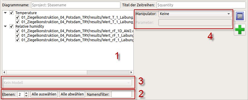
This window contains a number of items:
| [1] |
The series to be used can be selected in the tree window |
| [2] |
Filter and grouping options (2); the name filter searches for series identifiers containing the entered filter text and displays only these identifiers, the display in levels enables a grouped selection or deselection of series (see section grouping rules). |
| [3] |
Below the tree window a model conversion can be selected in the selection list for suitably selected data series (see section models) |
| [4] |
To the right of this is a selection list with options for manipulators, i.e. calculation and conversion rules for individual data records (see section manipulators) |
4.2.1. Grouping rules
First of all, all series identifiers containing a '.` (dot) are separated at this point and sorted into grouping levels. If the identifiers of a level of 2 or more series match, one level is displayed (up to the maximum level level specified in the window).
Example: A total of 6 series are selected from two files with the identifiers for temperature (LT) and relative humidity sensors (LR):
file: grouping.tsv

  Ground floor.LT1
  ground floor.LT2
  Top floor.XL1
  ground floor.LR1
  ground floor.LR2

File: grouping2.tsv
  ground floor.LT3
This results in the following grouping:
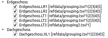
If the series identifiers are the same, for example in variant studies, the series identifier is created as the top level and the concrete file names as the second level. If only data records from one file are selected, the specification of the source file is omitted.
|
The numbers 1|2|3|4|5 following the file name in the example indicate which columns of the file are grouped together in this data record (see also column identification for grouped data records). |
4.2.2. Selection of the Y-axes
If several physical quantities are to be displayed in the diagram, the axes are assigned according to the order of the added series. The series added first is assigned to the left Y-axis and accordingly a unit is assigned to this axis. If a further series is added whose unit can be converted into this axis unit, the left Y-axis is also used. If the unit does not fit to the left Y-axis unit, the series and its unit is then assigned to the right Y-axis. All further series are assigned to the axes according to their units.
|
You can swap the left and right axis later, see section swap Y-axis assignment. |
The unit conversion and the units supported in PostProc 2 are described in the section system of units.
4.2.3. Invalidly added series
If the selected data sets have more than 2 incompatible value units, series are added to the diagram until both Y-axes are occupied. All others are marked as incorrect and a tooltip (hold mouse over it) shows the reason for the error:
4.2.4. 2D diagrams from 3D/4D/5D data sets
2D diagrams can also be created from 3D data sets (or 4D or 5D data sets). In this case a sectional plane must be defined, which usually results in a time-animated 2D profile diagram.
A 1D geometry (e.g. vertical wall) is simulated and a 3D data set with time, coordinates (along the X-axis) and values is created. If the X-value plane or a time-cut (TimeCut) is defined as a sectional plane, a 2D diagram (profile) results for each point in the data set. The coordinate is displayed on the X-axis and the value scale on the Y-axis.
The currently displayed time can be changed via the time animation control in the lower panel.
When a 3D/4D/5D data set is selected, a diagram configuration window is displayed below, in which you can first choose between colour gradient diagram and line/profile diagram. To create a 2D diagram, Line/Profile Diagram must be selected here. If several 3D data sets are selected, a line/profile diagram is the only choice.
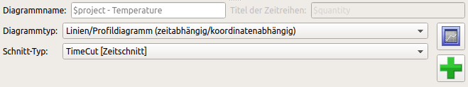
Finally, the plane section must be defined. Afterwards the diagram can be created as described so far using the button on the right.
Similarly, a 2D diagram is created from a 4D or 5D data set. Two or three coordinates must be defined, which is expressed in the name of the section line. For example, for an XT-cut (XTCut) the time and the X-coordinate are recorded.
|
The cutting coordinates can be adjusted at any time in the Extractor settings. |
4.2.5. Adding records to existing charts
In the data management window with the data set list it is possible to add data sets to existing 2D diagrams:
-
first select (activate) a diagram in the diagram tree (bottom left),
-
by clicking on the directory tree (top left), switch to the data manager view in the middle,
-
select one or more records to be added,
-
Click the Add button
 .
.
As a general rule, you can only add records to 2D diagrams. Furthermore, the unit of value must match one of the two Y-axes, or one Y-axis must not yet be used.
|
If you try to add an unsuitable record, an error message will appear when you click on the Add button. |
4.2.6. Data manipulators
To the right of the list of 2D data series to be added are options for configuring data series manipulators.
manipulators are instructions on how to change or convert the data series before the display in the diagram. These calculation rules are applied for each data update. So if the raw data change and these are read in again during the Updating the data, the manipulation rules are also processed before the data are transferred to the diagram.
|
When creating a diagram or adding data series, configured manipulators are defined individually for each data series. |
The following manipulation operations exist:
Manipulator: difference between current and first value
Here, the first value in a data series (usually time 0) is subtracted from the current value, for example:
Time [h] Original [-] Manipulated [-].
5 12 0
6 17 5
8 18 6
10 11 -1
This manipulator is useful if mass or energy differences to the initial state are to be determined, e.g. when analysing water absorption experiments.
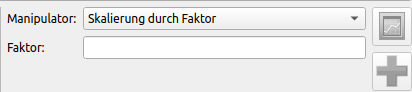
Manipulator: scaling by factor
Here, the respective numerical value of the original data series is multiplied by a factor.
Example, when using the factor '1
Time [h] Original [-] Manipulated [-].
0 0 0
1 2.5 -2.5
2 4.2 -4.2
3 8.5 -8.5
This manipulator is useful, for example, if you want to make a sign correction for flow outputs, e.g. to make comparisons between flow quantities with different sign definitions.
Manipulator: Offset (value shift)
With this manipulator data series can be shifted by a constant value.
Example, using a shift value of 2:
Time [h] Original [-] Manipulated [-].
0 0 -2
1 2.5 0.5
2 4.2 2.2
3 8.5 6.5
With this manipulator you can move data series vertically. This is useful, among other things, to display tolerance bands. In this case you can add the same data series to the diagram several times using a different displacement value.
|
In the current PostProc 2 version, manipulators cannot yet be adjusted/changed in the program interface, or added to data series at a later date. So at the moment you can only remove a data series and add it again with a newly configured manipulator. However, it is more practical to change the manipulator definition directly in the session file. See the documentation in section session file format. |
4.3. 3D diagrams
3D diagrams can be created from 3D, 4D or 5D data sets, with a colour gradient diagram always being created.
For diagrams from 3D data sets, the time is plotted on the X-axis, the coordinate (whether X, Y or Z coordinate) on the Y-axis, and the values are displayed converted to colour values.
For diagrams from 4D or 5D data sets, the configuration window again offers the possibility to define a section.
|
It is not possible (or useful) to display two 4D data sets simultaneously in a colour gradient diagram. If two or more 4D data sets are selected, the configuration window is therefore deactivated. |
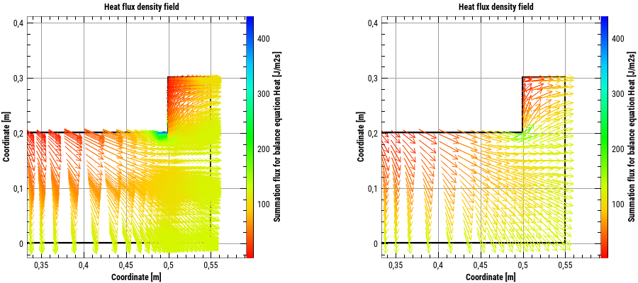
4.4. Vector field diagrams
Corresponding vector field diagrams can be created from data sets with vector fields:
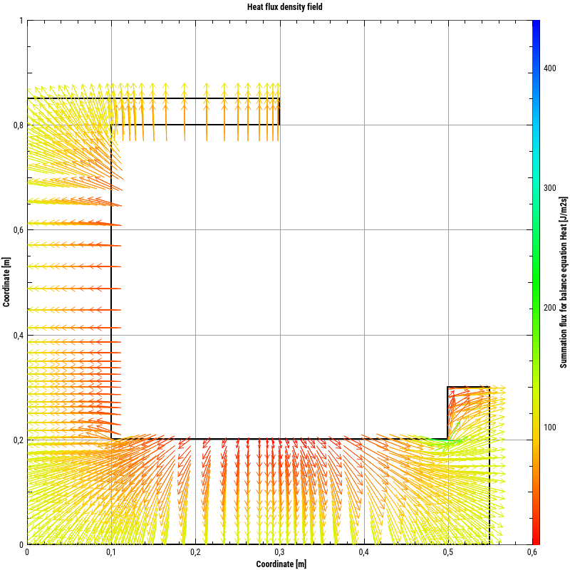
For vector field data there are a lot of possibilities to adjust the properties palette:
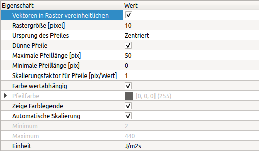
Vector field data are usually stored in relation to a calculation grid. If the vector arrows are drawn for each data point, this can lead to a high arrow density where nothing can be seen. Therefore, it is also possible to combine all arrows in a grid and draw the averaged arrow in the centre of the grid in alignment and length. This is switched on by the option Unify vectors in grid. The following figure shows the comparison between native and raster-based arrow display:
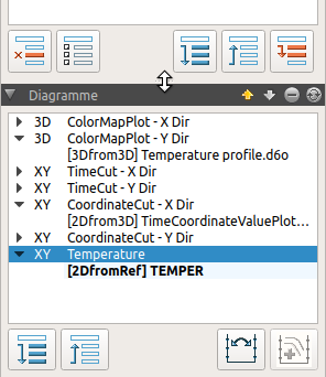
5. Diagram management
5.1. diagram tree structure
Below the directory tree the created diagrams are displayed in a tree view. The top level always corresponds to the diagram; the diagram identifier is displayed (property name in diagram formatting).
|
The directory tree and diagram tree window can be adjusted in height by dragging the mouse up/down between the two windows on the handle (see changed mouse symbol in the screenshot above). |
The ![]() buttons can be used to expand or close the contents of each diagram in the tree view.
buttons can be used to expand or close the contents of each diagram in the tree view.
5.2. Diagrams and series/lines
The lines or series shown in the diagram are shown below the diagram node. Colour gradient diagrams always have only one entry here.
There is always one diagram active/selected. In addition, a dataset is always selected/active, i.e. with line charts one line/series is always active. The selection corresponds to the line selected in the properties window for line charts.
|
The order in which records or series/lines are added determines the character sequence. The lines are drawn in a diagram in the order they are listed in the diagram management tree. Moving a line within a diagram affects the order of the lines in the legend as well as the drawing order in the diagram itself. |
The two buttons ![]() can be used to move both diagrams in the tree view and lines within a diagram.
can be used to move both diagrams in the tree view and lines within a diagram.
5.3. Remove series and diagrams
Individual lines/series can be removed using the Minus button ![]() . If the last series is removed, the diagram is also deleted. If the diagram node itself is marked, the diagram with all series/lines is deleted.
. If the last series is removed, the diagram is also deleted. If the diagram node itself is marked, the diagram with all series/lines is deleted.
5.4. Axes exchange and profile doubling
Most chart and data series settings are made in the various properties windows.
For 2D diagrams, the assignment of the Y-axes (if two Y-axes are used) can be exchanged by the button ![]() integrated in the diagram tree.
integrated in the diagram tree.
The second button in the diagram tree serves a special function. With time-animated profiles, it can be used to double the data series and to fix the time for the original data series. This simplifies the creation of profile variant diagrams (see example in the section Extractor Properties).
5.5. Data update
The post-processing reads the source data from the files and keeps this data in memory. In the meantime, the files could change, e.g. a simulation program could append results for further times, or the files could have been completely rewritten. To ensure that the post-processing shows current data again, all diagrams can be updated.
The update is done either by clicking on the update icon ![]() in the diagram tree window.
in the diagram tree window.
A data update can also be forced by the menu item: Data - Diagram/Update data, or by the keyboard shortcut F5 or Ctrl+R (see also shortcuts).
|
The update is always performed for all diagrams and all data sets contained in them, regardless of the currently selected/active diagram. If different diagrams obtain data from the same original data sets/files, the corresponding files are of course only read once again. |
Depending on the type of data presented, you can immediately see an influence on the results:
-
In 2D-diagrams with time axis and automatic axis scaling, the diagram shows the complete new data (maybe less than before, if the result file was rewritten from scratch and now contains less data points)
-
In the case of time-animated colour gradient diagrams, the last time of the newly read-in data file is normally displayed, but only if the selection on the time scale (in the lower panel) is on the last data point.
The menu option Data - Automatic diagram/data update can be switched on and off. If it is switched on, the update function is executed once per second.
Sometimes it is not possible to update the data, e.g. because the input file is incorrect. In this case the data stored in the memory is not changed. An error message is displayed in the log window or written to the log file (see Error Analysis/Log File).
|
It is possible that due to incorrect/unsuitable changes to raw data, the data is not updated and old data is still displayed in the diagrams. However, as this data is not saved permanently (the session file itself does not contain any data), the diagrams will be empty the next time the programme is started or the session file is loaded, even though the data is currently still displayed. At this point it only helps to restore or recreate the data set files, e.g. by running the simulation again. |
6. Diagram window
The diagram window or windows occupy the main part of the PostProc 2 application window. Each diagram window has a header:

If it has a blue background, this diagram is active. In the selection list of the diagram title bar the diagram currently to be analysed can be selected. Alternatively (as already described) the current diagram can also be set via Selection in the diagram tree.
6.1. Diagram and table view
The data of a diagram can be displayed in two ways. Once as a graphical diagram, and once in a tabular data view.
The ![]() and
and ![]() buttons at the top of the chart window switch between chart view and table view. The chapter TableView and Data Interpolation describes the table view in detail.
buttons at the top of the chart window switch between chart view and table view. The chapter TableView and Data Interpolation describes the table view in detail.
6.2. Diagram division
It is possible to split the diagram window so that two or more diagrams are visible next to each other or below each other,
This is useful for variant analysis or when profiles of more than 2 different physical quantities are to be displayed simultaneously. The division can also be made several times, e.g. temperature and humidity profile at the top, vapour pressure and liquid water content profile in the middle, vapour and liquid water conductivities at the bottom.
The division is carried out via the menu commands: Chart - Horizontal division etc. and/or via short commands.
It is also possible to use the divider button ![]() of the chart window, in which case a vertical or horizontal division is automatically selected depending on the larger dimension.
of the chart window, in which case a vertical or horizontal division is automatically selected depending on the larger dimension.
A diagram window can be made to disappear either by menu commands or by using the close button ![]() .
.
7. Diagram formatting
The presentation of the diagrams and the lines/colour gradients contained therein can be changed in the respective property windows on the right side of the screen. In the following, the diagram options are first described, which apply equally to all diagram types.
7.1. Chart options
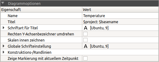
The following properties can be adjusted.
| Property | Description |
|---|---|
Name |
diagram identifier, is used to manage the diagram in the diagram manager/diagram tree and in the selection box in the diagram window (can contain placeholder). |
Title |
Title, which is displayed above the diagram (can contain placeholder). An empty string removes the title. |
Font for title |
Font and font properties for the title
|
Draw scales inside |
If switched on, the axis scales are drawn inside the diagram frame. |
Global font setting |
A change to these font properties affects all fonts used in the diagram and overwrites any font settings previously made. It is therefore advisable to first change the font globally and then make the individual settings for axis titles/legendary entries etc. construction/edge lines (only for 4D data) |
7.1.1. Placeholder/ text replacement
Depending on the context, placeholders can be used for text attributes to automatically replace text modules. This is useful, for example, for series and axis titles. Currently the following placeholders are supported, but not all placeholders are (can be) replaced everywhere, see description.
| Placeholder | Replacement text |
|---|---|
|
Physical value unit, useful for axis titles |
|
Full path to the data file from which the series originates |
|
The file name of the data file from which the series originates. For DELPHIN outputs, the base directory name is also prefixed, i.e. for a data file Wall1/results/TemperatureProfile.d6o, $filename = Wall1/TemperatureProfile.d6o. |
|
file name of the data file without path and extension |
|
Physical quantity (e.g. temperature or moisture mass density) |
|
Current date (only in diagram title) in format 27.02.2003. |
|
Current selected time for time-dependent data records, displayed as time interval from the start time |
|
same as ATTENTION: pay attention to the nested brackets |
|
same as |
|
|
7.2. Extractor properties
This is where cut coordinates/times of a data series are defined. This concerns 2D diagram series (data series), which are cut out of 3D/4D or 5D data, or 3D diagram data, which are extracted from 4D or 5D data sets.
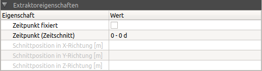
Depending on the type of cut (TimeCut, XCut, YCut, ZCut), different times or cut areas can be defined separately for each of these data sets. In the example picture above a time cut is used. Time points are usually set/changed using the Animation buttons in the lower panel. However, it is also possible to enter and also fix the time point in this tab so that when the animation time point is changed, the time point of this data series remains unchanged.
|
By fixing the point in time for time-animated profile lines, the profiles can be displayed at different times in the same diagram. To do this, the same data series is added several times and different time points are set and fixed in the extractor properties. 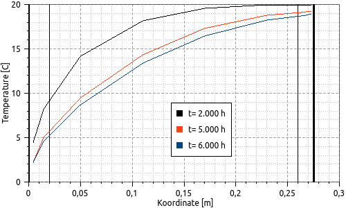
Figure 33. Profile section diagram with several data sets, with different fixed times
Creating such diagrams is simplified by the |
7.3. Axis representation
The properties window for the axes contains a selection list at the top, from which the axis to be edited can be selected. Different settings are offered depending on the axis and diagram type. Only the lower axis can be configured as date/time axis.
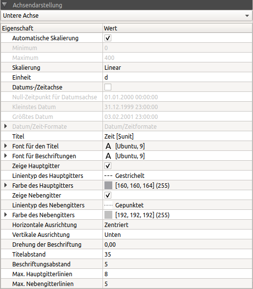
Most axis properties are self-explanatory. For some settings special information is given below:
| Property | Description |
|---|---|
Scaling |
Switches the axis scale between linear and logarithmic display. Data series should not contain 0 values in logarithmic representations. The logarithmic representation is reinforced by suitable selection of the grid lines. Unit |
Unit |
Unit which is to be displayed on the axis. A change of the unit causes a conversion of the axis scales to the new unit. The unit name is inserted in the placeholder |
Date/Time axis |
If activated, a concrete date is displayed instead of the time intervals. The type of display is defined by the date/time formats. With automatic axis scaling the scale range is adjusted to even time intervals depending on the resolution. |
zero time for date axis |
The data records usually contain data as time intervals to a selected reference time. This property allows the definition of this time point. |
Date/Time Formats |
A different axis labeling is used depending on the zoom level or time range displayed. These labelling texts can be adapted here. The date/time elements are transferred according to a format definition. The following format abbreviations for the definition of time formats are supported:
A typical date time format would be for the hourly zoom level: |
title |
axis title, can contain placeholder. An empty text removes the axis title. Multi-line caption texts can be created if |
Gridline type and colour |
Here you can define the appearance of the gridline. Although the main and secondary grid can be switched on and off separately for the X-axis and the left Y-axis, there is only one line and colour setting for the main and secondary grid respectively. |
Title distance |
Actually the distance of the axis scale line from the diagram border and therefore in case of a displayed title also the distance of the title from the axis. |
|
The title spacing setting can be used to set a uniform size and spacing for diagrams that are aligned with each other or side by side (when inserted in a document after diagram export). If the title spacing is the same, e.g. for the left-hand axis, the axis lines of diagrams arranged underneath each other are also exactly aligned with each other, regardless of the length of the axis labels/labels. |
7.4. Line charts
In line diagrams the individual lines and the legend can be formatted.
7.4.1. Legend settings
Line diagrams contain a legend for identifying the individual lines with the following setting options:
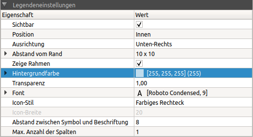
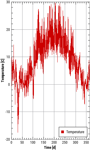
The legend can be placed inside or outside the diagram (property Position). Legends on the inside are always anchored to an edge or corner (property alignment). The distance from each edge is controlled by the property of the same name. If the diagram is enlarged or reduced, e.g. in the case of diagram export, the legend remains positioned in relation to the anchor point.
|
An internal legend can be dragged to any position with the mouse (Drag&Drop). Depending on the storage location, the nearest anchor position is selected and the distance calculated. |
The following is an example of an inner legend anchored at the bottom right for different diagram sizes:
The properties frame, background colour and transparency only apply to legends on the inside.
The icon style defines whether line style and symbol should be shown in the legend or only a coloured rectangle. The latter is the default setting, as diagrams are created by default with solid lines of equal thickness and without symbol:
The width of the line in the line symbol display can be configured via the Icon Width property.
If a very large number of lines are to be displayed, the number of legend entries can be selected next to each other via the property Maximum number of columns. A 0 means that a suitable number of columns is determined automatically depending on the diagram width.
|
The automatic determination of the number of columns in the legend does not work with an inner legend, because there is no information about the allowed width. If the plot area becomes smaller than the legend, it will be cut off to the left or right or top/bottom accordingly. With legends on the inside you should therefore always specify the maximum number of columns. |
7.4.2. Formatting the lines
The properties window for line attributes has a selection list in which the current line can be selected. The selection corresponds to the highlighting/marking in the diagram management tree.
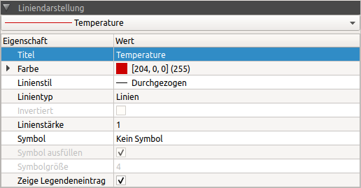
The attributes for the lines correspond to the usual settings for lines in line charts.
|
The line colour and symbol colour are always the same for a data series/line. If you want to have different line and symbol colours, you can insert the data series a second time and format it once as a line and once as a symbol (without a line). So that the data set does not appear twice in the legend, you can switch off the property Show Legend Entry for a data series. |
The following properties have a special meaning:
| Property | Description |
|---|---|
Line type |
Defines the way the X-Y data values are to be interpreted and displayed: Lines:_ normal lines, where the individual data points are connected by lines (useful for linear courses between grid points) Sticks: Vertical lines between data points and the X-coordinate axis steps: between single data points (i.e. in the interval between two interpolation points) the courses are assumed to be constant. The additional attribute inverted determines whether the value at the beginning of the interval or the value at the end of the interval should be used. This is useful, if e.g. abruptly changing values (control parameters, e.g. target temperatures) are to be displayed. points: at each given data point a filled circle is drawn in the diagram. Here the line thickness defines the diameter of the circle. If other symbols are to be drawn instead, the line style should be set to No line and then a symbol should be selected. |
Inverted |
See line style steps |
Show legend entry |
If this property is deactivated, no legend entry is shown for the current line. This is also useful if, for example, you want to display the upper and lower limits of a line as symbols, and you do this with additional data series (which of course should not appear in the legend). |
|
If the property Show legend entry is switched on again, the legend entry appears at the end of the legend. This is independent of the character sequence, i.e. the order in which the series/lines were added to the diagram. Thus legend entries can also be sorted as desired. However, this is not saved and the next time the session is loaded the original order is restored. |
7.5. Colour gradient/spectral diagrams
There are two types of colour gradient diagrams:
-
time progression plots, where the X-axis is the time axis and the time progression of a 1D profile curve is shown, and
-
Profile or field diagrams, in which the distribution of values is shown over a 2D geometry for one point in time each.
The latter are always time animated diagrams (see diagram animation).
With colour gradient diagrams, a colour legend is always displayed on the right-hand side. This is configured in the axis properties window (right axis) in the same way as other axes. However, all properties concerning the colour table are defined in the properties window for the colour table.
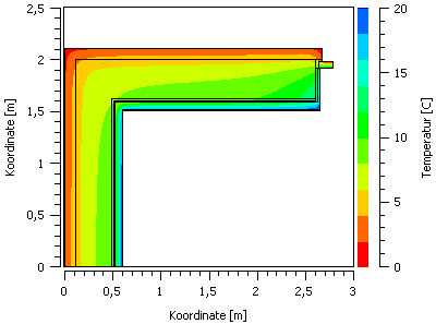
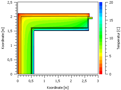
The interpolation mode influences the way (colour) values are calculated within grid elements. For the volume/element centric data supported by post-processing, the individual values are defined for the centre of a grid element. There are now different options to display this data. To draw a smooth gradient between these individual values, values are first calculated for the nodes (i.e. grid corner points) by weighted interpolation. Then the colour values within a grid element can be determined by weighting the corner values (linear interpolation).
For the property interpolation mode there are 3 options:
-
Raw data: This representation shows the values actually calculated in the simulation program, i.e. no interpolation takes place. Large differences between adjacent elements may indicate that the grid is too coarse, so this display is especially useful for grid sensitivity studies/accuracy control.
-
Bands:** The values calculated by interpolation are assigned to the defined colour bands (see also colour table) by rounding. For example, are there colour value assignments for 20, 16, 12, … °C, and the calculated temperatures are 19.2°C or 17.3°C, these are rounded down to 16°C and thus drawn in the colour of the 16°C band. This representation is best suited to quickly get an overview of the distribution and gradients of the values.
-
Interpolated:**The values calculated by interpolation are mapped directly to a colour value, again interpolating between colour table values. For example, are there colour value assignments for 20, 16, 12, … °C, and a calculated temperature (or one interpolated from key values) is 19.2°C, the colour to be drawn is determined by interpolation between the colour values for 20 and 16°C. For 19.2°C, the colour value of 20°C is therefore weighted correspondingly higher than that of 16°C.
For colour gradient diagrams, isolines can also be drawn, i.e. curves that run along level lines, e.g. lines of the same temperature. The property type of representation allows the choice between, colour gradient diagram or colour gradient diagram with isolines. It is also possible to draw only isolines, which can be useful for black and white publications.
Other features are:
| Property | Description |
|---|---|
Isolines |
Allows the closer definition of isolines by numerous sub-properties. The sub-property Interval determines the number of isolines. Normally this number matches the defined colour bands so that isolines are displayed at the band boundaries. |
Construction/Borderlines |
In 2D geometry details there are often material borders and construction borders. The way these lines are drawn is configured by this property. |
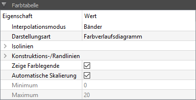
Show colour legend |
Switches the right axis with the colour legend visible or invisible. |
Automatic scaling |
If this is switched on, the value range limits are automatically determined from the currently displayed data set. |
7.5.1. Automatic scaling and global minima and maxima
With time-animated colour tables, only the data of one point in time is displayed. However, the values calculated for each point in time can change drastically over time, i.e. the current minimum and maximum values are usually different from the global minimum and maximum values (of all data).
The property Automatic scaling, if switched on, always uses only the numerical values of the currently displayed point in time to calculate the maximum/minimum values.
The button Calculate global min/max values, on the other hand, runs through the entire data set and enters the maximum and minimum as value range limits.
|
In the case of time-animated diagrams, post-processing only reads in the times/time ranges actually used for performance reasons (which is very fast, especially with binary data containers). To determine the global maxima and minima, however, the complete file must be read into the memory, which can take some time depending on the hard disk speed and also fills the main memory. Therefore there is no option to perform this automatic min/max calculation every time the file is changed. |
7.5.2. Definition of the colour table
Colour tables are always relatively defined and are then applied to the value range. So if, as in the following example screenshot, 10 colour intervals are defined, the uppermost colour value always corresponds to the maximum numerical value, while the lowest colour value always corresponds to the minimum colour value. The colours in between are defined in equal intervals.
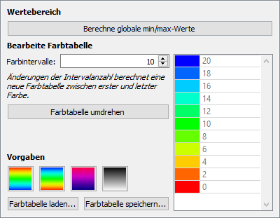
The number of colour intervals has primarily an effect on the band display and the contour lines. The following screenshots show the difference between 10 and 20 colour intervals. With a very large number of colour bands the representation approaches the interpolated mode (see description of the interpolation mode property above).
The colours of the colour chart can also be changed individually. By double-clicking on the individual colours a colour selection dialogue opens. In this way, for example, even critical value ranges can be highlighted:
Completely new colour transitions can be created by first selecting the top and bottom colour and then changing the number of colour intervals. This will recalculate the colours in between based on the colour wheel.
Once certain colour tables have been defined, they can be saved in *.p2colormap files and loaded again (with the correspondingly named buttons). These files have a simple XML format and can also be generated externally.
8. Save and apply saved chart styles
If you want to configure several diagrams with the same appearance, you can first save the format of one diagram and then later apply it completely or partially to other diagrams.
8.1. Saving diagram styles
The menu command Chart - Save current diagram format... opens a dialogue for entering a unique name for the diagram format to be saved. The diagram format is saved in a file and the entered name is used as a file name for the diagram file to be created.
Diagram format files are stored in the user data directory, in the subdirectory styles.
After confirming the dialogue, the format of the currently selected diagram is written to the file. Then the diagram format name appears in the menu: Chart - Apply saved diagram format to.
8.1.1. Predefined line styles in format/chart style files
In a diagram format file, always the same number of diagram styles are saved as in the original diagram. If such a format file is applied to a diagram with more lines, only the saved diagram styles are transferred, the other lines are given default settings (colours, line thicknesses etc.). If the target diagram has fewer lines, only the formats for the existing lines are transferred.
8.2. Apply a saved format
When the programme is started the directories for diagram styles are searched and the names of the files (without extension) are displayed in the menu Chart - Apply saved diagram format to.
Built-in chart styles are searched in the installation directory, i.e. {installation directory}/resources/styles, user-defined chart format files are searched in the directory {PostProcApp user data}/styles (see user data directory). Diagram format files have the extension p2style.
|
If there is a file with the same name as a built-in style file in the user-specific template directory, only the file in the user directory is displayed in the menu. |
As soon as a diagram format has been selected in the menu, a dialogue with selection options opens. The individual format components to be transferred can be selected here. After confirming the dialogue, the changes are applied to the currently selected diagram.
8.3. Apply last used format
Once a chart format has been applied, the name of this file is noted. This format can then be quickly selected again, either by the menu command Chart - Apply chart format '<name>' on or by the short command Ctrl + F. This allows a format to be quickly applied to newly created charts.
The program remembers this format file as long as the file exists and no other format has been selected and applied.
|
The short command |
8.4. Edit, rename and delete a chart style or chart format file
Chart format files contain a portion of a PostProc session file. Therefore, they can also be created manually or edited with the text editor. The format files *.p2style can also be easily renamed or deleted. The next time the programme is started, the menu is updated with the available diagram styles.
9. Diagram animation
Diagrams in which time slices are cut out of the initial data (TimeCuts) can be animated over time. These are, for example, colour gradient diagrams of 2D geometries, whereby the colour gradient is only displayed for one point in time. Or line diagrams from 1D geometries, which are displayed as time-animated profiles.
The term time animation initially refers only to the rather convenient setting/changing of the current point in time. For this purpose there is a slider in the lower panel, with which the current time can be moved flexibly. You can also use the animation buttons to control the time change like a movie (and with the small slider on the far right you can adjust the speed). You can also enter the desired time directly as a number.
In the lower panel on the left side all diagrams that can be animated in time, i.e. diagrams without time axis, are listed. As soon as at least one diagram is selected, the time points available in the data set are shown in the scale on the right and the animation buttons are active. As soon as the current time is changed, all diagrams are updated accordingly.
|
If the time of a data series is fixed in the Extractor Properties, the data set does not change even if the slider is changed. |
9.1. Simultaneous animation of several data sets
If several data records are marked at the same time, all marked data records are also animated simultaneously. The time scale shows the total of all times available in the different data sets. If, for example, one record contains daily values, but the second contains hourly values, hourly values are shown. However, the unit can be changed. If a time point is selected, either the exact time selected or the next earlier time is used in the respective data record, if available. There is no interpolation.
For example, 2 data sets are shown, one has the time 0 12 24 in hours, while the other has 0 1 2 in days. When compiling the time animation scale, the time points are first converted into the same unit and then merged, resulting in 0 12 24 48 in h. Rounding errors can also occur when converting time points, which could then lead to a common time axis such as 0 12 24 24.000001 48.
If, for example, the time point 12 h is selected with the slider, this time point is selected in the first data record, but this time point does not exist in the second data record. Therefore the time 0 d is displayed in the 2nd data record.
When updating the data, the time scale is also adjusted if, for example, new points in time are added to a data series due to the simulation progressing. The following rules apply:
-
If the last point in time is selected beforehand (slider on the far right), then after the update the slider is automatically set to the last point in time again when new data series are added. This means that the last profile is always displayed when updating - practical for observing the simulation progress.
-
If a different time than the last one is selected before the update, this setting remains. Thus, if a certain point in time is selected, the diagram remains unchanged even if the data is updated. If this point in time no longer exists after the update, the nearest point in time is selected.
10. Table view and data interpolation
If you switch to the table view (see Diagram and Table View) the data shown in the diagram is displayed as numbers in a table. So you can read concrete values or simply export the data to another application.
10.1. Data export
The displayed data can be copied to the clipboard. The copied table can then be pasted directly into a spreadsheet program (Excel, LibreOffice, …). The data are copied as columns separated by tabs (according to the TSV format, see TSV files), which can be read by PostProc.
The selection of data or marking of cells is done as in any usual spreadsheet program like Excel/LibreOffice etc.
In the table properties window on the right hand side you can choose whether only the current selection or the whole table should be copied.
|
The button Copy everything to clipboard is ultimately only a convenience function. You can also use Ctrl + A to select all cells in the table, and then copy the selection. |
The following options are available that influence the export:
10.1.1. "Copy headers"
In 2D diagrams, the line headings are copied, so that a generated file looks like this, for example
Time [h] Var1.temperature [C] Var2.temperature [C]
0 10 10
1 12 11.5
2 16 13
...
If the option is disabled, only the actual data is copied.
For 3D diagrams, if the option is switched on, the coordinates in the headings are copied to the top lines and the left column.
10.1.2. "Units on separate line"
Causes the export in format. This only makes sense if the line headings are very long and the unit is then cut off/not visible in the target application.
Time Var1.temperature Var2.temperature
[h] [C] [C]
0 10 10
1 12 11.5
2 16 13
...
|
This format is not supported by PostProc 2, see also format specification in the section TSV files. |
10.1.3. "Use , instead of . as decimal separator"
This makes it possible to differentiate between German and English number format. Helpful when exporting to Excel/LibreOffice (which requires German number format) and in text files for further use in other tools, whereby English number format is required.
10.2. Data filtering and interpolation
If time series with different points in time are displayed together in a table, the missing values are interpolated linearly between the neighbouring grid points (which corresponds to the graphic representation in line display). Interpolated values are coloured to distinguish them from values actually contained in the data set:
Interpolation is particularly helpful if, after export to a spreadsheet, you want to perform further calculations (difference formation, etc.) with the data series.
The rules used for this are explained below.
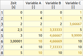
The following data sets are used in the above example:
Time [s] Variable A [-]
0 0
1 4
2 2
3 10
4 10
Time [s] Variable B [-]
0 0
2 2
5 10
Time [s] Variable C [-]
1.00000000001 1
2.5 5
3.00001 10
4 10
These data sets contain different time series. In data set C the situation is simulated which occasionally occurs in numerical simulations, i.e. due to rounding errors in glide number calculations, time 1 is sometimes not exactly 1 but minimally greater or smaller, in this case 1.00000000001.
In further processing of the data, these points in time should nevertheless be treated identically, which is why all points in time with a relative distance of less than 1e-9 are considered to be the same.
|
The exact formula is: TOLERANCE = |t_i|*1e-9 + 1e-7 Points in time are considered to be different if t_{i-1} + TOLERANCE > {t_i}
is. |
In the case of time points 3 and 3.00001 the distance is greater and the time points appear individually listed in the table.
|
In the time column, the times of all data series are displayed sorted. For the data sets for which these time points do not exist, the time points are approximated according to the rules described below. Values calculated in this way are coloured for differentiation (see screenshot above). |
10.2.1. Interpolation of intermediate values
If values are not available in a data set, they are interpolated linearly. For example, for data set B, t=1 results in the interpolated value 1.
10.2.2. Extrapolation
If values are missing at the beginning or end, they are extrapolated constantly from the next or previous value. For example, dataset C does not contain values for time 0 nor for the last time 5, so the first available value (from time 1) is displayed for time 0. And for time 5 the last one (from time 4).
10.3. Filter time points
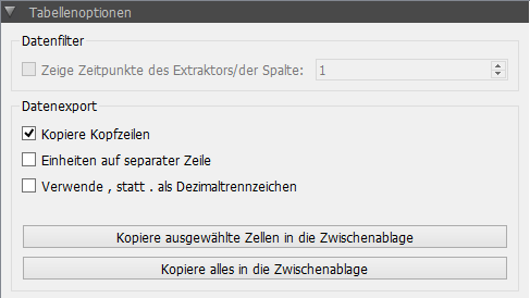
For the analysis, it is sometimes necessary to use the time points of a time series as reference (e.g. hourly values) and not to use intermediate time points from other time series. In this case, the time points of a data set can be selected as filters.
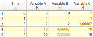
Filtering is activated via the selection box Show times of the extractor/column. Then the column number corresponding to the data set is selected (numbering starts with 1 for the first data set after the time column). If, for example, column 1 (data set A) is selected, only the times of this data set will appear in the table:
10.4. Adjust time unit
The time column in the table view normally shows the same unit as used for the X-axis in the diagram. If you want to use a different time unit when exporting data or searching for a specific time, you can set this in the selection list.
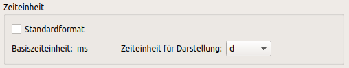
|
When the standard unit is used for display, the numbers are displayed with standard value formatting, usually with 6-digit accuracy. However, if a time unit is selected from the drop-down list, then a number formatting typical for this time unit is chosen. |
|
If the times are displayed with date/time stamps, the base unit is ms (milliseconds), since time is internally managed in milliseconds since the reference year. |
11. Models - damage prognosis
In PostProc 2 there is the possibility to apply models to selected data. This is currently possible for 2D data in the form of time series. The models are selected from a list in the lower part of the main window of the data management view (see [3] in Figure 2D diagram configuration window).
To select a model, exactly one 2D data set of temperature values and one 2D data set of relative humidity data must be selected. A model selection is only possible if exactly these two data sets are selected.
In the current version of PostProc 2 the following models are implemented and can be selected in the selection list:
-
Isopleth model
-
VTT Schimmel models
-
WTA wood destruction model
-
VTT wood destruction model
-
Algae growth model for bricks
A click on the Create Diagram button creates a diagram according to the selected type with the basic settings. If No Model is selected, a line diagram is created with the two selected datasets (see section 2D Diagrams).
The data sets do not necessarily have to have the same time unit and step size for use in models. However, hourly values are recommended.
11.1. Isopleth model
The isoplethene model is used to estimate the risk of mould growth on freely weathered surfaces. More detailed information on this model can be found in the
WTA leaflet 6.3
and in
Sedlbauer, K. : Evaluation of mould formation on and in building components. Dissertation University of Stuttgart (2001).
This model shows the relative humidity (y-values) against the temperature (x-values) at the same time. Immediately after creation, a diagram as shown in the following picture is displayed.
You can now adjust the appearance of the diagram with diagram settings (properties window at the bottom right):
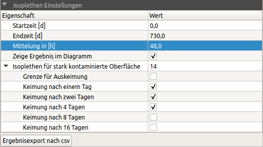
Among other things, you can display the isopleths for different germination periods and thus configure the following isopleth diagram, for example:
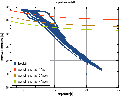
The settings are described in detail below:
11.1.1. Start time/end time
Only the values in the specified period are considered. For the evaluation it is usually useful to hide the first year so that transient processes do not distort the result.
|
If you stay with the mouse briefly over the input fields for start/end time, the possible range is shown in the corresponding tooltip. |
11.1.2. Averaging
Usually hourly values (instantaneous values at the end of the hour) are used for the calculation and are also displayed.
For a mould formation the used limit values must be exceeded for a longer period of time. Accordingly, the germination isopleths are also defined for certain periods of time, e.g. 1 day or 2 days. For a visual evaluation of the calculation results it is therefore recommended to average the individual values in a similar time interval, e.g. by using 24 h as an averaging interval (enter 24 h in the field averaging). In case of longer germination intervals, the averaging period should be increased accordingly.
|
The averaging interval only has an effect on the diagram displays, but not on the numerical calculation of the exceedance frequencies/overrun periods. |
11.1.3. Show result in diagram
If the check mark is set in this field, the exceedance periods for each selected isoplethe are also shown in the legend.
11.1.4. Isopleths
In this area the different isopleths can be selected. Here, a distinction is made according to the nutrient supply at the surface and the duration of possible growth. There are isopleths for one day, two days, 4 days, 8 days and 16 days. This means that the conditions at the surface must be above the limit line (isopleth) for the period mentioned above in order for mould to grow. There is also a line for the germination limit. This describes the lower limit for the germination of mould spores. Below this line, the risk of mould formation is zero. In the picture above the isopleths for germination limit, one day and two days are selected.
11.1.5. Export of results to csv
This button at the bottom of the dialogue exports a table with the exceedance frequencies for all isopleths as a csv data record to the clipboard. From there it can be transferred to a word processing program or spreadsheet (Excel/LibreOffice-Calc/etc.):
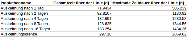
Two columns are displayed:
| Total time |
How many days were the values above the limit line in the whole selected period. A transgression is only calculated if the time of each single transgression exceeds the value of the isoplethe. |
| Maximum time |
This is the longest time in hours for exceedings with this Isoplethe. This value can also be shorter than the time span of the corresponding Isoplethe. In this case the exceeding time would be zero. |
11.2. VTT mould model
The VTT mould model is a mathematical model for the dynamic calculation of mould growth from temperature and relative humidity of a surface. It was developed by Hannu Viitanen of VTT in Finland. More information can be found e.g. in
Hukka A.; Viitanen H.: A mathematical model of mould growth on wooden material. Wood Science and Technology 33(6). 1999, S. 475-485.
The result of this model is a time course of a mould index:
Mould index and associated criteria
| Mould index | Growth | Description |
|---|---|---|
0 |
no growth |
spores not active |
1 |
microscopically visible, low growth |
germination |
2 |
microscopically visible, <10% coverage |
- |
3 |
visually visible, 10-30% coverage |
new spores are produced |
4 |
visually visible, 30-70% coverage |
medium growth |
5 |
visually visible, >70% coverage |
strong growth |
6 |
Coverage 100% |
Very strong and dense vegetation |
A mould evaluation diagram for the VTT mould model is created in the same way as for the isopleth model. The created diagram can be adjusted with the corresponding diagram properties (at the bottom right of the properties palette).
Three parameters can be set in the option dialogue.
| Type of material |
|
| Type of surface |
|
| Type of mould growth |
|
11.3. WTA wood destruction model
This model is used to demonstrate wood degradation by wood-destroying fungi. It is described in
WTA Leaflet 6.8 (2016) Chap. 6.4.1.
It applies to solid wood (including solid structural timber, glued and dowelled timber products, glued laminated timber, etc.) Here a kind of linear isoplethe is used for the temperature range 0°C to 30°C. A risk of wood destruction is considered to exist if the surface values are above this line as a one-day mean value. The mean value is calculated in the model.
Further details can be found in the following literature:
Kehl, D.: Humidity-related dimensioning of timber constructions according to WTA - Hygrothermal evaluation of the other kind. In: HOLZBAU - die neue quadriga, issue 06-2013, Kastner Verlag, Wolnzach 2013.
This model is also referred to in DIN 4108-3 of 2018 (Chap.D.7.4 p. 72).
The only parameter that can be entered here is the evaluation period. This is done analogously to the isopleth model. Just like there, an overrun period in days can be shown in the legend. It is also possible to export a table as a csv (see result export to csv).
11.4. VTT wood destruction model
11.5. Algae growth on a brick surface
The present model describes the increasing coverage of an outer surface for brick masonry with algae. A final documentation of this model is still pending. A first description can be found here:
Quagliarini, E.; Gianangeli, A.; D’Orazio, M.(among others): Effect of temperature and relative humidity on algae biofouling on different fired brick surfaces. Mater. 199. 2019, p. 396-405., doi:10.1016/J.CONBUILDMAT.2018.12.023.
The temperature and relative humidity on an external surface are also to be used as input variables. Hourly values are preferable here. The diagram shows the coverage of the surface with algae, which over time approaches the maximum value for the material used.
The parameters are the porosity of the material on the surface and the roughness of the surface. The porosity can be taken from the material properties of the simulation model used. The parameters are entered in the option dialogue in the lower right corner of the diagram properties palette.
The parameters have the following limits:
| Porosity |
0.19m³/m³ to 0.44m³/m³ |
| Roughness |
2.95µm to 7.6µm |
12. Diagram export
One of the strengths of PostProc 2 is the print-ready diagram export, whereby precise size and scaling settings can be made depending on the target application.
Diagrams can optionally be exported as:
-
bitmap graphics (pixel/raster-based, ideal for web pages), and
-
Vector graphics (pdf, svg, emf) for printed publications
can be created.
Diagrams can be exported in two ways:
-
quick direct copy to the clipboard with default settings, and
-
by using the export dialogue with very detailed export settings.
To export a diagram, the respective diagram window must be selected.
12.1. Quick copy to clipboard
When executing the menu command: Chart - Copy current chart to clipboard an EMF vector file is automatically copied under Windows and a bitmap image (like a screenshot) under Linux/MacOS. This will export the diagram with the current size.
For example, the diagram displayed on the screen in this way:
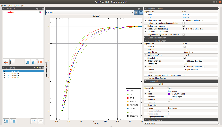
exported as a nearly 1-to-1 image when using the copy to clipboard command:
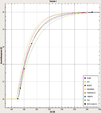
12.2. Using the export dialog/diagram layout for publications
Often, however, detailed export settings are required with regard to target size, resolution, etc. These can be selected in the diagram export dialogue. The export dialogue can be opened with the menu command: Chart - Export current diagram or with the short command Ctrl+E.
The diagram export differs fundamentally between pixel-based bitmap images and vector graphic images. In the dialogue, this basic setting can first be made by selecting the Bitmap or Vector Graphics tab.
After selecting the format-specific settings (see following sections) the diagram can either be saved as a file or copied to the clipboard.
12.2.1. Selection of the diagram destination

To save in a data file, the data path including extension must be entered in the file name line (1). The selection button (2) can also be used for this purpose. Depending on the file extension entered (note lower case!), the target format is determined.
Currently supported are
Vector graphic formats:
-
pdf- PDF file -
emf- (Windows only) - Enhanced MetaFile image file -
svg- SVG vector graphics file
Bitmap graphic formats:
-
png- PNG image -
jpg- JPG image -
bmp- BMP image
The actual image is written by the button (3) Export to file.
|
When the file is saved, any existing file is overwritten without further confirmation. However, if you use the file name selection dialogue, if you select an existing file, you will be asked whether this file should be overwritten. This does not immediately lead to overwriting the file, but only when the Export to file button is pressed. |
Alternatively you can copy the image to the clipboard (button (4) Copy to clipboard).
12.3. Vector graphic export
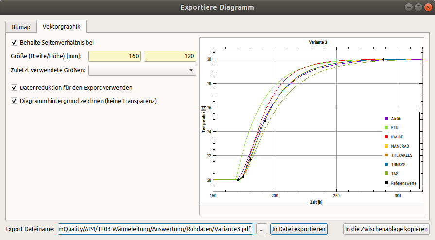
Vector graphics have the advantage that the quality is maintained when the image is scaled. This is therefore also the recommended format for diagrams to be printed. You can then create a PDF file, for example, or integrate the graphic as an EMF file (Windows) or SVG file into other documents.
It is essential to ensure that the format settings of the lines and titles are taken into account exactly when exporting. This means that if you have set the font size to 10pt, the text will also be written with 10pt when exporting diagrams - regardless of whether you export a 10x10cm or 150x150cm diagram.
|
The appearance of an exported chart differs from the on-screen display depending on the settings, so a preview is displayed. |
For publications it is often important to specify font sizes in illustrations in the exact size required, for example Arial 9pt. PostProc 2 supports this by allowing you to set individual sizes for font and line thicknesses in the diagram configurations and then use these exactly as they are when exporting. If, for example, you insert a 12x7cm diagram with exactly this size into another document, the characters will be exactly the same size when the document is printed.
When the diagram is exported, the diagram is redrawn with the specified size, although the propertions and axis scaling may of course change. Therefore a preview of the diagram is displayed.
|
The vector export also adjusts the line thickness. If you draw a line with 1px width on a FullHD screen with 1920x1080 resolution and this is also clearly visible, a 1px line scaled accordingly will appear as very thick (e.g. 0.8 mm thick) when exported to a printable diagram. Therefore line thicknesses are halved when exporting vectors. |
The most important setting for vector export is the target size. If Keep aspect ratio at is activated, the other size is automatically adjusted proportionally when the width or height is changed. Previously selected aspect ratios can be accessed via the drop-down menu Recently used sizes.
In addition to setting the target size of the diagram (in mm), there are two further options.
12.3.1. Use data reduction for export
An additional data reduction algorithm can be switched on when exporting line charts with a large number of data points as vector graphics. This removes all points which are approximately on the connecting line between the neighbouring points and therefore do not add any value to the diagram. The Douglas-Peucker-Algorithm is used here.
Data reduction can help to drastically reduce the size of the created PDF/SVG/EMF files without any visible loss of quality, for example, a line graph with 180000 points from 18 Mb to 0.2 Mb.
During data export, only the number of segments in the line (polyline) is reduced. Symbols are drawn for each point, if visible. The operation therefore results in a visually equivalent diagram representation.
|
When copying a vector graphic to the clipboard via the menu command copy current diagram to clipboard a data reduction is always applied. |
12.3.2. Draw diagram background (no transparency)
By default, this option is enabled and a white, single-colour area is drawn under the diagram. This is necessary for the PDF-A export, among other things, since transparent vector drawings are not permitted here.
If, however, you want to have a transparent diagram explicitly, for example to insert it into a presentation with a different colour background, you can switch off this option.
12.4. Export as pixel-based graphic/raster image
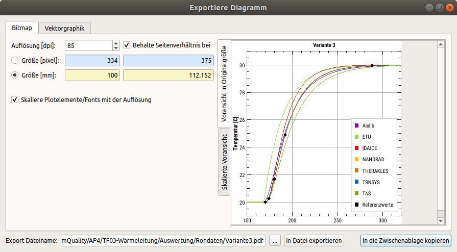
Diagrams are usually only exported as raster images if they are needed, for example, in web pages or other raster-based display formats. Since a precise representation is often desired here, there is an exact preview of the exported image.
For resolutions larger than the export dialogue window, progress bars are displayed in the original size preview. You can also select the proportional preview.
Since raster graphics can also be used for printing, the size can be set once by pixel dimension and once by size and resolution.
12.5. Tips and tricks for creating charts for publications/printing
Diagrams for printing (for publications, books etc.) should always be exported as vector graphics.
The following procedure is recommended:
-
configuration of the diagram in the screen view
-
define the font and size, can be done centrally for the whole diagram via global diagram options
-
open the export dialogue
-
define the diagram size, e.g. 16 cm width for normal A4 paper or 8 cm for double-column printing. Select the height in the same way.
-
preview - this shows the proportions of the diagram to be exported, which may well differ from the screen proportions. If necessary, close the export dialogue window and adjust fonts and line thicknesses.
-
export the diagram and define the size accordingly when inserting it into the target document.
12.5.1. Uniform alignment of several diagrams in the document
If several diagrams are used in a document, it is recommended that the same font and size be used for all diagrams. The export sizes should also be the same.
In addition, the axis property title distance can be used to set a uniform distance between axis and diagram title (and thus also diagram border). This is useful, for example, if two diagrams with different scale sizes are displayed one below the other.
Example for vertically aligned diagrams: on the left (standard formatting) there is an offset due to the different scale sizes, on the right the title spacing in the upper diagram was set to the same distance as in the lower diagram, and both diagrams are aligned exactly vertically
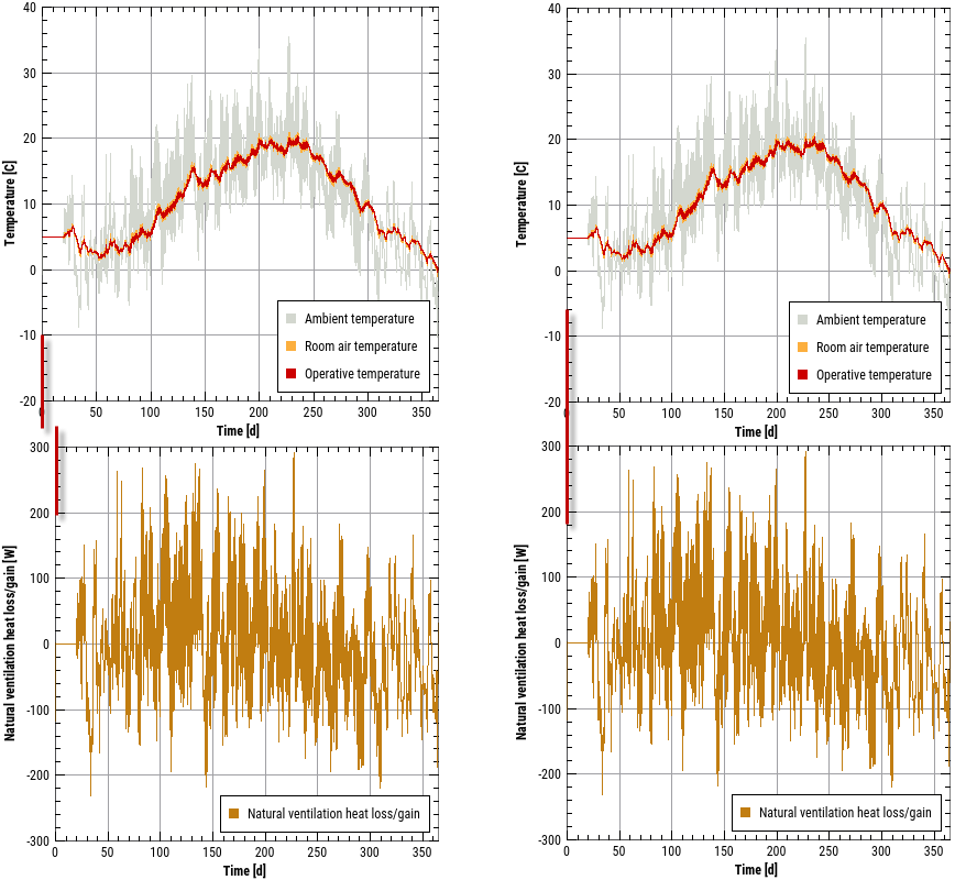
12.6. Automated diagram export
It is also possible to export the diagram automatically via a command line command, see section Automated diagram creation via command line command.
13. reference
13.1. shortcuts
Many post-processing functions can be executed by double-clicking or using a keyboard shortcut:
| Short Command/Action | Function |
|---|---|
Double click (on data set in data manager table) |
Create a graph for the currently selected data set with default options |
Ctrl+N |
Create new empty session |
Ctrl+O |
Open session |
Ctrl+S |
Save session |
Ctrl+A |
Select all, in lists and tables, e.g. in the table view of the diagram data |
Ctrl+E |
Export of the currently selected diagram, diagram must have focus (click with mouse on it) |
Ctrl+F |
Apply last selected chart format to current diagram |
F5 / Ctrl+R |
Update data (reload) |
F2 |
Open current session file in text editor |
Ctrl+1 |
Split current diagram horizontally (2 diagrams below each other) |
Ctrl+2 |
Split current diagram vertically (2 diagrams side by side) |
Ctrl+0 |
close diagram window/undo division |
F11 |
full screen mode on/off (in full screen mode all panels are folded away) |
13.2. Command line reference
The following command line arguments are supported:
Syntax:
> PostProcApp [<Options>] [<Session File>]
Possible options are shown with the argument ---help:
syntax: PostProcApp [flags] [options] arg1 arg2 ...

flags:
  --help Prints the help page.
  --man-page Prints the man page (source version) to std output.
  --cmd-line Prints the command line as it was understood by the command
                    line parser.
  --options-left Prints all options that are unknown to the command line
                    parser.
  --no-splash Disables splash screen.

options:
  --long=<en;en;de;it;...>
                    Specify the program language using a 2 character language
                    ID.
  --generate-chart=<n:bxh:fn>
                    Export chart #n, with dimensions 'width x height' and
                    filename fn like 'diagram1.pdf'.
  --generated charts=<exportSpecsFile>
                    Exports several charts using export specs from given file.
If a session file is transferred, the post-processing restores this session at program start. Under Windows/Linux the file extension p2 is linked to _ PostProc 2_, so that when a session file is double-clicked, the PostProc starts with this session.
The main optional arguments are:
--no splash
|
Disables the splash screen |
--lang=<language-id>
|
Indicates the programme language with which the programme is to be started. Possible language IDs: de, en, it |
--generate-chart
|
opens PostProc 2, reads the session file passed, generates a chart according to the argument options and closes the program again |
--generate-charts
|
In principle like |
13.2.1. Automated diagram creation using command line command
The above mentioned command line arguments --generate-chart and --generate-charts can be used to create charts automatically. In combination with a script-based creation of a session file it is possible to generate charts completely automatically.
The argument --generate-chart is used to export a single diagram. For example, the command
> PostProcApp --generate-chart=2:160x100:diagram1.pdf diagramme.p2executes the following work steps:
-
start PostProc 2
-
open the session file
diagrams.p2 -
change to diagram #2
-
create the PDF file
Diagram1.pdfwith 160x100 mm resolution of Diagram #2 -
close the program and return to the command line
If you want to create several charts of the same session file, you can do this in principle by starting the application several times with the generate-chart argument. However, this can take a long time with larger session files. You can therefore create a text file with one export definition per line instead. An example of this would be:
1:160x120:../report/diagrams/variants1.pdf
2:160x120:../report/diagrams/variants2.pdf
3:160x120:../report/diagrams/variants3.pdf
4:160x120:../report/diagrams/variants4.pdf
Each line contains the same parameters as would be passed to the --generate-chart argument. Now start the postprocessing with:
> PostProcApp --generate-charts=exportSpec.txt diagrams.p2where the argument --generate-charts defines the absolute or relative path to the specification file.
13.3. System of units and list of units
PostProc 2 has a built-in unit system which is used for unit conversion. This allows, for example, data series with units that can be converted into each other to be displayed in a diagram.
A data series contains laboratory measurement data, which are logged in minute steps: unit of value=g (gram), unit of time=min (minute)
If you now create a 2D diagram from such a data series, the X-axis will be given the unit min and the Y-axis the unit g.
Now add another data series (from a simulation), using the standard SI unit kg as the unit of value and s as the unit of time. PostProc 2_ now tries to determine the conversion factor from kg to g by using the table of units, and likewise for s to min. Then the values of the data series are converted accordingly and displayed in the diagram.
The unit system is based on direct 1-to-1 conversions. In most cases these are scales, and in the case of C to K a shift of values. Special unit conversions like sqrt(s) to s are directly integrated.
Correlations between units, e.g. m2/s resulting from the calculation of m * m/s, are not integrated, as such calculations are not carried out in PostProc 2.
13.3.1. List of units
The following table lists all units supported in PostProc 2, i.e. units that can be used as value and time units in data files.
Supported units:
| Base SI unit | Convertible units |
|---|---|
- |
|
--- |
%, 1 |
---/d |
%/d |
1/K |
|
1/logcm |
|
1/m |
1/cm |
1/Pa |
|
1/s |
1/min, 1/h |
J |
kJ, MJ, MWh, kWh, Wh |
Y/K |
kJ/K |
J/kg |
kJ/kg |
J/kgK |
kJ/kgK, Ws/kgK, J/gK, Ws/gK |
J/m2 |
kJ/m2, MJ/m2, GJ/m2, J/dm2, J/cm2, kWh/m2 |
J/m2s |
W/m2, kW/m2, MW/m2, W/dm2, W/cm2 |
J/m3 |
Ws/m3, kJ/m3, MJ/m3, GJ/m3, J/dm3, J/cm3, kWh/m3 |
J/m3K |
kJ/m3K |
J/m3s |
kJ/m3s, MJ/m3s, J/dm3s, J/cm3s, J/m3h, W/m3, kW/m3, MW/m3, W/dm3, W/cm3, W/mm3 |
J/mol |
kJ/mol |
J/s |
J/h, J/d, kJ/d, W, kW, MW, Nm/s |
K |
C |
K/m |
|
K/Pa |
|
kg |
g, mg |
kg/kg |
g/kg, mg/kg |
kg/m |
g/m, g/mm, kg/mm |
kg/m2 |
kg/dm2, g/dm2, g/cm2, mg/m2 |
kg/m2s |
g/m2s, g/m2h, g/m2d, kg/m2h, mg/m2s, µg/m2s, mg/m2h, µg/m2h |
kg/m2s05 |
kg/m2h05 |
kg/m3 |
kg/dm3, g/dm3, g/cm3, g/m3, mg/m3, µg/m3, log(kg/m3), log(g/m3), log(mg/m3), log(µg/m3) |
kg/m3s |
g/m3s, g/m3h, kg/m3h, mg/m3s, µg/m3s, mg/m3h, µg/m3h |
kg/m3sK |
g/m3sK, g/m3hK, kg/m3hK, mg/m3sK, µg/m3sK, mg/m3hK, µg/m3hK |
kg/mol |
g/mol |
kg/ms |
|
kg/s |
kg/h, kg/d, g/d, g/a, mg/s, µg/s |
kWh/a |
|
kWh/m2a |
|
l/m2s |
l/m2h, l/m2d, mm/d, mm/h |
l/m3s |
l/m3h |
logcm |
|
logm |
|
logPa |
|
Lux |
kLux |
m |
mm, cm, dm |
m/s |
cm/s, cm/h, cm/d |
m/s2 |
|
m2 |
mm2, cm2, dm2 |
m2/kg |
|
m2/m3 |
|
m2/s |
cm2/s, m2/h, cm2/h |
m2K/W |
|
m2s/kg |
|
m3 |
mm3, cm3, dm3 |
m3/m2s |
m3/m2h, dm3/m2s, dm3/m2h |
m3/m2sPa |
m3/m2hPa |
m3/m3 |
Vol% |
m3/m3d |
Vol%/d |
m3/s |
m3/h, dm3/s, dm3/h |
m3m/m3m |
m3mm/m3m |
mm/m |
|
mol |
mmol |
mol/kg |
mol/g |
mol/m3 |
mol/ltr, mol/dm3, mol/cm3 |
Pa |
hPa, kPa, Bar, PSI, Torr |
Pa/m |
kPa/m |
person/m2 |
|
wheel |
deg |
s |
min, h, d, a, sqrt(s), sqrt(h), ms |
s/m |
kg/m2sPa |
s/s |
min/s, h/s, d/s, a/s |
s2/m2 |
|
W/K |
|
W/m2K |
|
W/m2K2 |
|
W/m2s |
W/m2h, kW/m2s, MW/m2s, W/dm2s, W/cm2s |
W/mK |
kW/mK |
W/mK2 |
|
W/person |
kW/person |
undefined |
The entities undefined and - have special meaning. The latter is used for variables without units. PostProc 2 gives the unit - to all data from input files without specified unit.
|
The unit |
13.4. Session file format
The session file is structured as follows:
<?xml version="1.0" encoding="UTF-8" ?>
<PostProc version="2.2.1">
	<!--List of all directories-->
	<Directories
        ...
	</Directories

	<!--All mappers.-->
	<Mappers>
        ...
	</Mappers>

	<!--Split window state.-->
	<Splitting>
        ...
	</Splitting>
</PostProc>
13.4.1. XML element <Directories>
The information about the directories imported into the session and which of them are currently selected, i.e. content and state of the directory tree is stored in the session file in the section <Directories>.
<!--List of all directories-->
<Directories
	<Directory>
		<Path>1DGeometry</Path>
		<SubDir Color="#550000" Checked="1">DirectSimData</SubDir>
		<SubDir Color="#ffaaff" Checked="0">FluxFieldTest/horizontal_flux_field</SubDir>
		<SubDir Color="#c66300" Checked="0">TimeCoordinateValuePlot/TimeCoordinateValuePlot</SubDir>
		<SubDir Color="#005500" Checked="0">TimeCoordinateValuePlot/TimeCoordinateValuePlotYDir</SubDir>
		<SubDir Color="#ffee00" Checked="1">TimeCoordinateValuePlot/TimeCoordinateValuePlot_withGap</SubDir>
		<SubDir Color="#ff5500" Checked="0">xtime_plot/climate</SubDir>
		<SubDir Color="#aa55ff" Checked="0">xtime_plot/xtime_plot_nogaps</SubDir>
		<SubDir Color="#aaaa00" Checked="0">xtime_plot/xtime_plot_nogaps.results</SubDir>
		<ExpandedSubDir>TimeCoordinateValuePlot>/ExpandedSubDir>
		<ExpandedSubDir
		<ExpandedSubDir>xtime_plot</ExpandedSubDir>
	</Directory>
	<Directory>
		<Path>/home/ghorwin/svn/PostProcApp_trunk/data/Examples/2DGeometry</Path>
		<SubDir Color="#ffee00" Checked="0">LShape</SubDir>
		<ExpandedSubDir
	</Directory>
</Directories>
Each directory added will appear in its own <Directory> element, with the path specified as either a relative or absolute path:
-
as a relative path to the session file directory, if the selected directory is located below this session directory
-
as absolute path if the selected directory is located elsewhere (parent directory, different directory hierarchy, different drive, etc.)
In the example above, the session file is saved as /home/ghorwin/Simulation/1DSim.p2, and thus the first imported directory 1DGeometry is located in the path /home/ghorwin/Simulation/1DGeometry. The paths given in the xml-tags <SubDir> are to be understood relative to this directory. The second imported directory is specified with absolute path, because this directory is stored outside the session directory structure (starting with /home/ghorwin/Simulations).
|
If you want to copy/move an entire directory structure with session file and records, or use it in a version control system, you should place the session file in the top directory. This way all directories are created relative to the session file path and the session file can be used directly on different computers without further path adjustments. |
The attributes of <SubDir> are self-explanatory. The optional <ExpandedSubDir> tags are used to store the expanded state of the directory tree.
13.4.2. XML element <Mappers>
This element ultimately contains a list of <mapper> elements, each representing a diagram.
13.4.3. XML elements <Mapper>
A <Mapper> XML tag contains all data for a diagram and the data series displayed in it. Two XML tags are included:
<Mapper name="Surface temperature">
	<Extractors>
	    <!-- Definition how data is extracted from source files -->
	</Extractors>
	<ChartModel chartType="2D">
	    <!-- Definition of how data and graphs are to be presented -->
	</ChartModel>
</Mapper>
In data storage, too, there is a separation between the description of how the data is extracted from source files and the definition of how the data is to be presented.
For each data series in the chart there is an Extractor tag within the parent Extractor tag.
XML elements <Extractor>.
Each Extractor element defines a data series. An example of a 2D data set is shown below:
<Extractor>
	<DataIOFileName>1DGeometry/DirectSimData/surface_temperature.d6o>/DataIOFileName>
	<CutType>NoCut>/CutType>
	<DataFormat>DF_2D</DataFormat>
</Extractor>
And here is an example of a 2D data series, extracted as a time slice from a 3D data set
<Extractor>
	<DataIOFileName>1DGeometry/DirectSimData/temperature_field.d6o>/DataIOFileName>
	<CutType>TimeCut>/CutType>
	<DataFormat>DF_3D</DataFormat>
	<CutIndexT locked="no">218</CutIndexT>
</Extractor>|
The path to the source file is relative to the session file path if the data file is located below this directory structure (recommended if you want to pass on session file and data files completely). If the data file is outside the session file directory structure, an absolute path is used. |
For 2D data sets with several data series per file, the information about the contained grouped data columns is appended to the file name, for example
<Extractor>
	<DataIOFileName>SimQuality_Case05/results/states.tsv?1|2|12|13|14/DataIOFileName>
	<CutType>NoCut>/CutType>
	<DataFormat>DF_2D</DataFormat>
	<DataType>T_REFERENCE>/DataType
	<ColumnIndex>2</ColumnIndex>
</Extractor>
Here the suffix 1|2|12|13|14 indicates that from the selected file states.tsv the data columns 1, 2, 12, 13 and 14 are grouped (see also grouping of data records by value unit).
The XML tag ColumnIndex specifies the how many columns are to be extracted. This index is 0-based, so in the example above
| ColumnIndex | Column in the source file |
|---|---|
0 |
1 |
1 |
2 |
2 |
12 |
3 |
13 |
4 |
14 |
13.4.4. XML element <ChartModel>
This XML element describes all diagram formatting. The XML element has an important attribute chartType, which can be either 2D, 3D or Vector.
For 2D diagrams the ChartModel XML element contains series format descriptions, e.g:
<SeriesProperties>
	<Series>
		<TitleText>$quantity</TitleText>
		<MarkerColor>#000000</MarkerColor>
	</Series>
	<Series>
		<TitleText>$quantity</TitleText>
		<PenColor>#ff420e</PenColor>
		<MarkerColor>#ff420e</MarkerColor>
	</Series>
	.
	.
	.
</SeriesProperties>|
There should always be as many |
The format definitions are very diverse. It is helpful to configure a diagram in the interface accordingly, save the session file and then adjust it if necessary.
13.4.5. XML element <Splitting>
This element describes the diagram division and assignment of the diagrams to the individual diagram windows. To be able to restore the diagram division and selection of the diagrams in the individual areas when reopening a session, a corresponding data structure is stored.
<!--Split window state.-->
<Splitting>
	<Widget id="1" parent="0" viewTable="0" mapperIndex="6" size1="498" size2="497" orientation="2" />
	<Widget id="2" parent="1" viewTable="0" mapperIndex="5" size1="498" size2="497" orientation="1" />
	<Widget id="3" parent="1" viewTable="0" mapperIndex="0" size1="485" size2="484" orientation="2" />
	<Widget id="4" parent="2" viewTable="0" mapperIndex="1" size1="485" size2="484" orientation="2" />
	<FocusedWidget>1</FocusedWidget>
</Splitting>
For each diagram window, one XML element <Widget> is created. The sizes specified therein are to be interpreted as suggestions, since the total size is limited by the current application window size, and each diagram itself requires a minimum size. The element <FocusedWidget> indicates which diagram window is currently active (number = WidgetID - 1).
It is important to consider the parent-child relationship. Similar to the manual splitting of diagrams, split windows are always assigned to a parent window as children. In the project file this information is stored in the attribute parent.
An example should clarify this. A standard session with a diagram window results in the following split data structure. The size is stored as 1x1, since the actual size of the windows depends on the application window.
<Splitting>
	<Widget id="1" parent="0" viewTable="0" mapperIndex="0" size1="1" size2="1" orientation="2" />
	<FocusedWidget>0</FocusedWidget>
</Splitting>
If the window is now divided vertically, the result is for example
<Splitting>
	<Widget id="1" parent="0" viewTable="0" mapperIndex="1" size1="498" size2="497" orientation="2" />
	<Widget id="2" parent="1" viewTable="0" mapperIndex="1" size1="498" size2="497" orientation="1" />
	<FocusedWidget>1</FocusedWidget>
</Splitting>
Here the 2nd widget (=diagram window) indicates that it has been divided by the parent window with ID 1 (parent="1") by vertical division (orientation="1").
If you now divide the left window horizontally you will get the following diagram division:
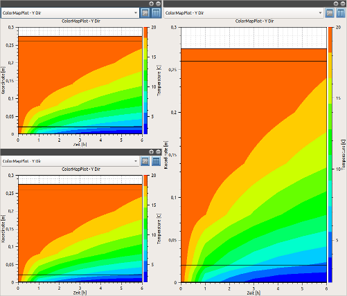
The corresponding part of the session file is:
<Splitting>
	<Widget id="1" parent="0" viewTable="0" mapperIndex="1" size1="466" size2="529" orientation="2" />
	<Widget id="2" parent="1" viewTable="0" mapperIndex="1" size1="466" size2="529" orientation="1" />
	<Widget id="3" parent="1" viewTable="0" mapperIndex="1" size1="485" size2="484" orientation="2" />
	<FocusedWidget>1</FocusedWidget>
</Splitting>|
The size specifications are to be understood as recommendations. If the program window is opened in the same size as when the session was saved, the appearance of the post-processing is restored to (almost) identical. |